Guide to Place Branding: How to Design City Brand Strategy [Case Study]
I’m an enthusiast of side projects. Working extra couple hours on things that we’re not certain how they turn out, is a bet that we need to make in order to grow.
I decided to make a place branding of the district I’m currently living in. And additionally, I wanted to make this task more challenging, so I limited myself to using only one font called Helvetica.
This side project felt quite ambitious because my district is not a fancy place that attracts many tourists from all over the world every year, nor it’s not the most popular district in my city.
However, the history of this place resonates with me. On the other side, the growth of design skills comes from exploring challenging and unexplored grounds.
The goal of the place branding was to present a district as a place with a rich history associated with factories, collectives, and worker-class but also modern-oriented, dynamically developing that provides a lot of opportunities.
So, the key to successful place branding was to build a bridge that connects two worlds in one consistent and coherent vision, using the power of context.
I hope you find my branding guide helpful and valuable. Maybe you learn something new that may inspire you in further projects!
1. Background
The day I wrote this post, I live in Warsaw, Poland. One of my favorite places is the district named Ursus.
In this place, we can see two different worlds living simultaneously. The first came from the previous communist system associated with factories, industry symbols, and machines. And the other side of Ursus is the modern one, rapidly developing with neon lights and big shopping centers.
We still can feel the old spirit lurking in the factory environment, but we are also witnessing a shift towards more modern-oriented solutions and buildings. However, there is one thing that is missing that would make this place coherent. And this is an element that will merge these two worlds.
My mission was to build a bridge that would connect two different worlds and create one common ground for them. So that we won't lose the rich history, often bloody, but teaching us values such as mutual help. On the other side, we will not lose ourselves in the world of neon lights, unification, and fast-paced globalization.
There are a few features that particularly helped me connect two worlds:
black and white colors (just as the photographies back then, and interiors of contemporary apartments)
simple, straight lines (just as then environment and design but also today's minimalism, modernistic design)
keeping old and traditional elements, such as a bear, a tractor, but in a modern, minimalist, and rejuvenated style
patterns to commemorate important dates and historical moments
In addition, I wanted to emphasize that it is a safe and cozy district, suitable for living that has an interesting culture and wealth of history but is also dynamically developing and modern-oriented. That's why I created patterns, symbols, and illustrations to show this connection.
2. Research / Inspirations
Place branding is the philosophy or a method of management that leads to satisfying the needs and desires of specific groups of recipients of territorial units. The main goal of place brandings is to shape the views, attitudes, and behaviors of interested customer groups in line with the interests of a given place.
To better understand this district and create consistent branding, I delved into the history of this place. Additionally, I was looking for inspiration in modern place identities. My goal was to create two boards, one for a given district and the second for the general inspirations. In the end, I wanted to find a connection between them both.
Moodboards
One of the crucial parts of successful and persuasive place branding is the understanding that each place has its own specific rules and management philosophy that meets the needs and desires of a specific group.
I was reading about the problems of the previous regime system and important events that shaped the Ursus district. I asked people about the current situation, challenges, and their hopes for awaited future to get a better understanding of how to approach the place branding correctly.
Research is a very important part of any branding process. Proper research helps to set the right direction. It allowed me to find common ground and connect the two worlds.
3. Design
a) Logos
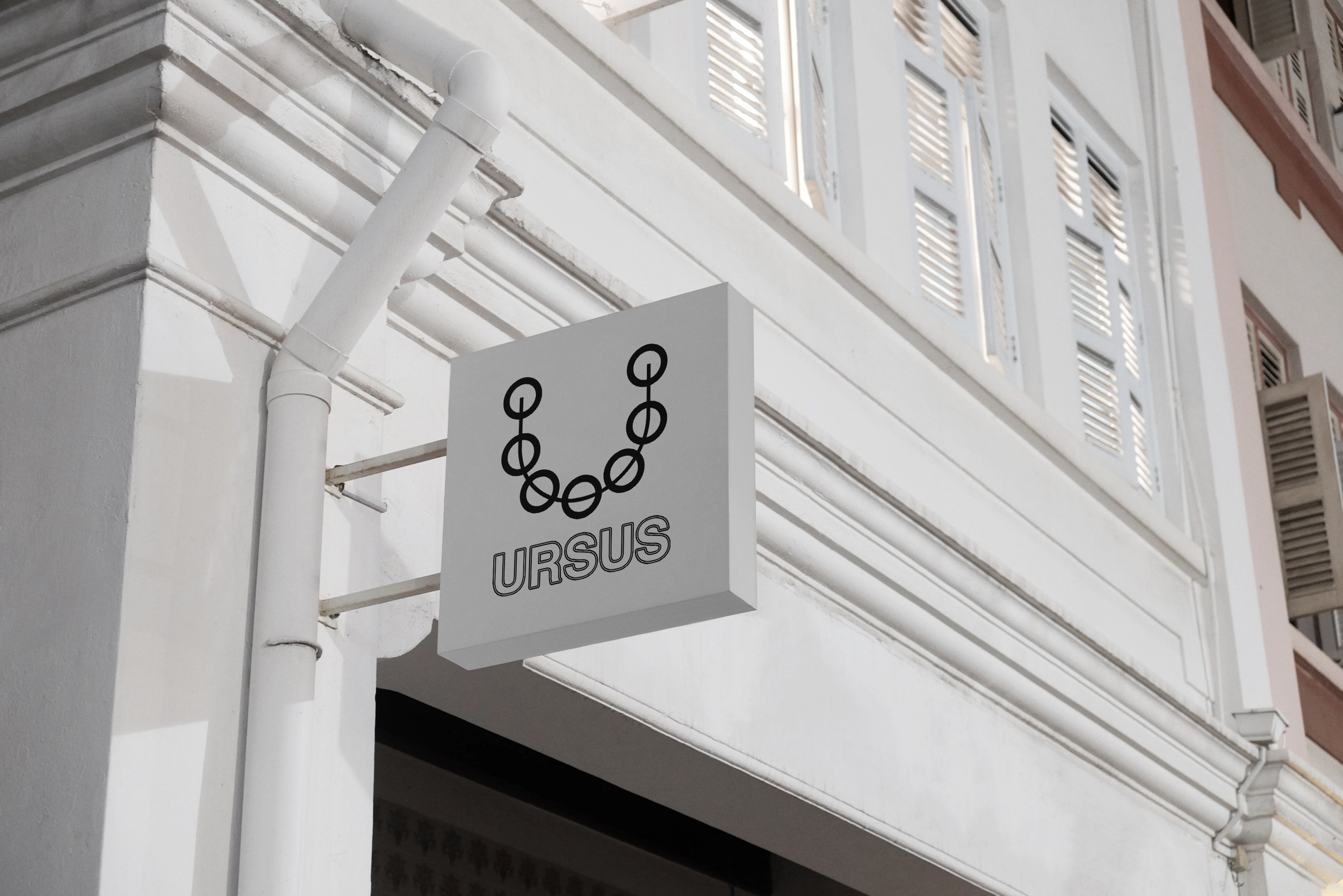
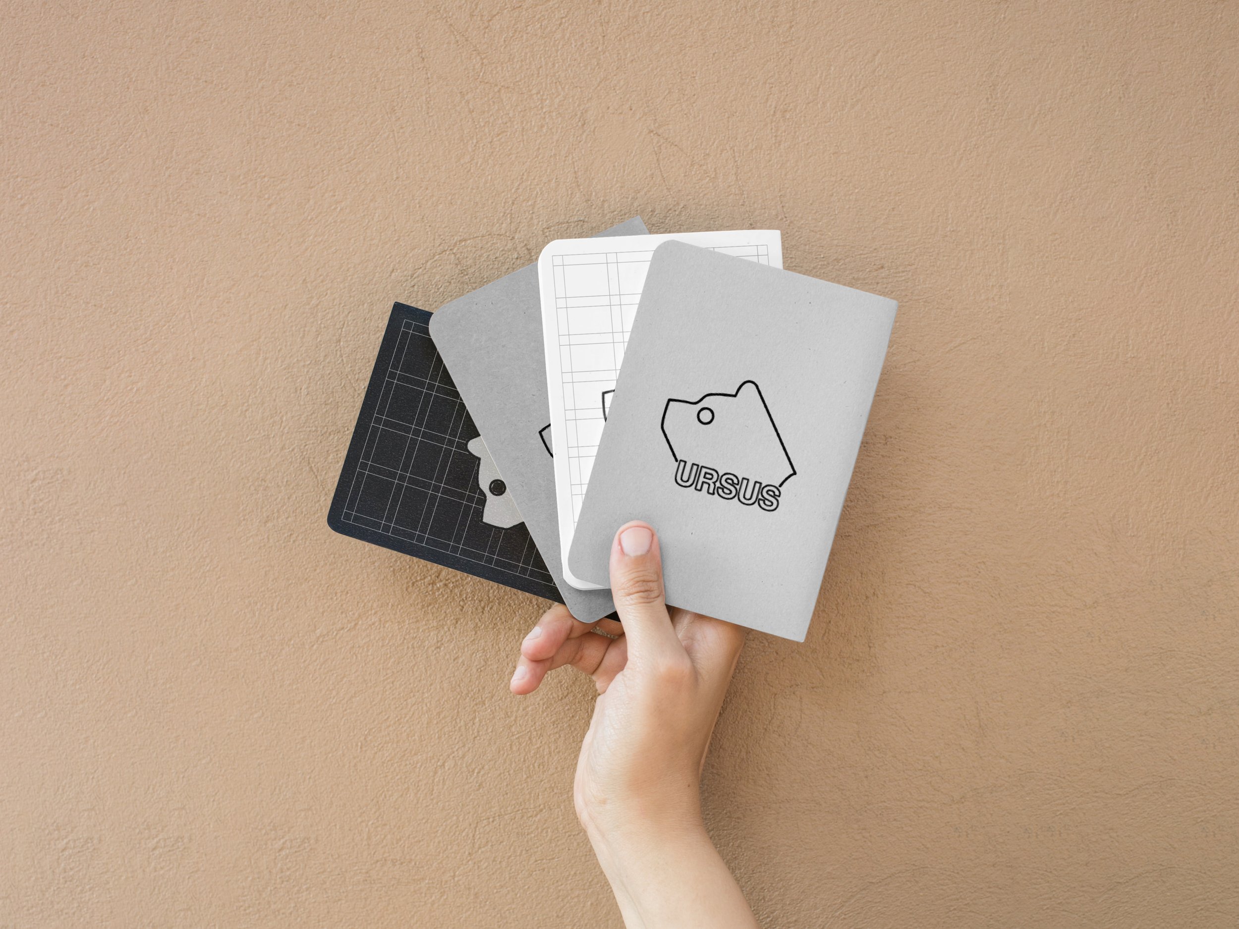
I decided to deviate from the conventional path and not create a main logo consisting of a logotype and a logotype. But make some logos that can be used interchangeably and for different occasions. But I still want these logos to work together to get the same sense of the same place.
For the logotype, I decided to follow my previous direction of coherently using Helvetica, and knowing the history of Ursus district, I found a logo of the 1968 Summer Olympics as a good point of reference. And I used it on purpose since the date of 1968 is also an important one for the Ursus district.
1968 Summer Olympics
I used it as the inspiration and reference point to further design explorations.
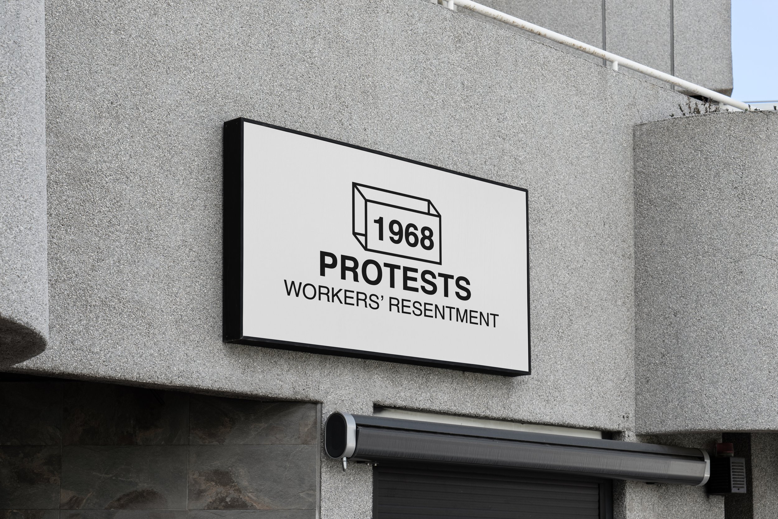
1968 was a year of nationwide workers' protests in Poland. People were outraged by the increasing poverty and censorship. This date shows the power of individuals that they can together make changes for the better. The sense of community is what I want to bring up and put in the new context of Ursus as a place that feels like home.
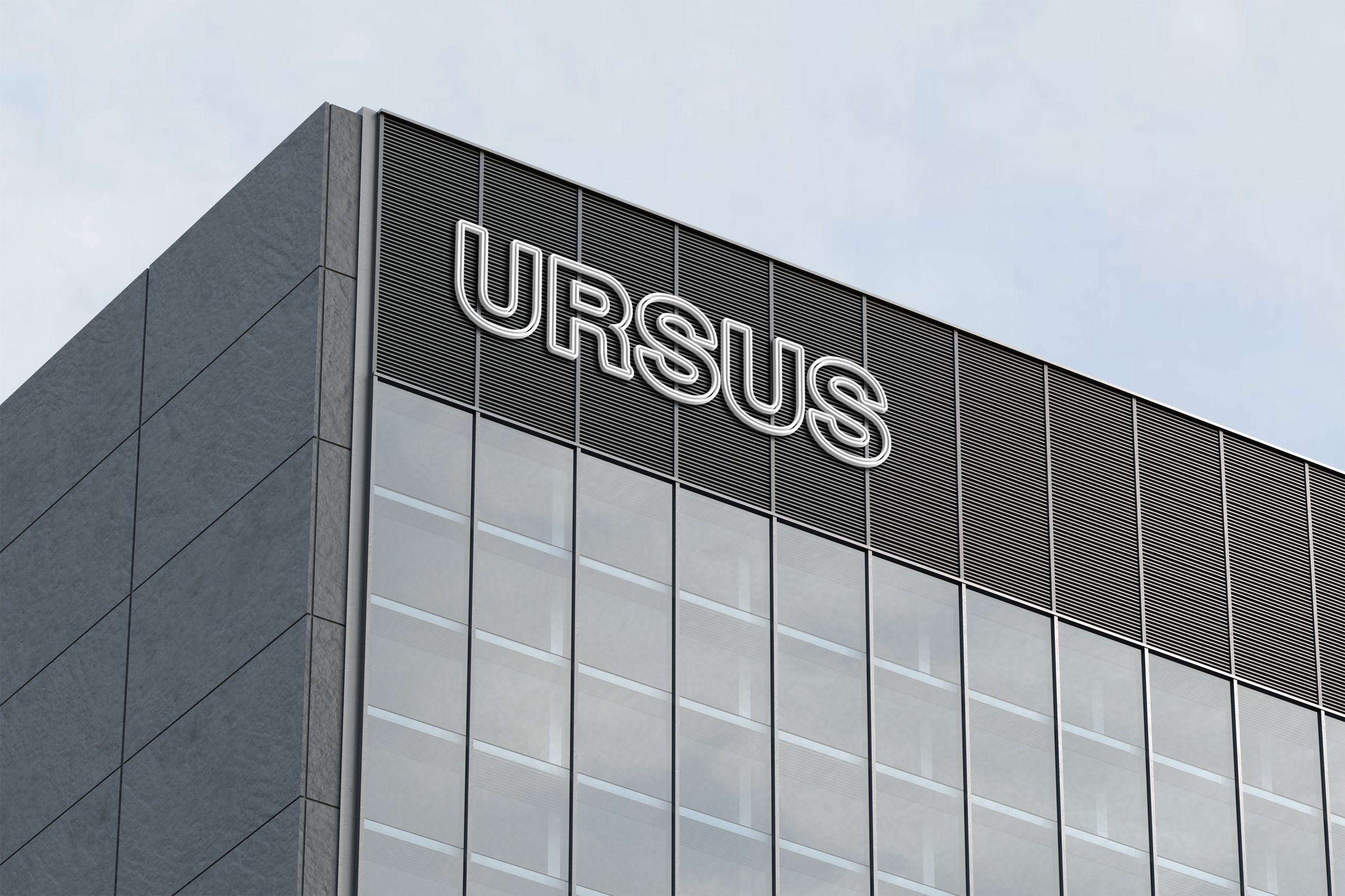
Making a couple of iterations of the logotype’s font outlines was the common ground. However, I didn't want to blindly follow the Mexico 68' path but make the logotype much lighter and more modern-oriented. Therefore the lines are thinner and most of all, they are more fluid and written into a wider context of use.
b) Typography
As I mentioned before, one of my limitations was that I only allowed myself to use only Helvetica typeface.
Helvetica is a widely used sans-serif typeface, which, with its simplicity on the one hand, and heaviness on the other, also fits well with the design related to the 20th century, as well as the modernist one.
There were two main reasons for working that way:
Firstly, it is always challenging to search different fonts, and such constraints raised the bar and tested my designing skills. In short, I wanted to test myself for the sake of a side project.
Secondly, in my opinion, there was something in Helvetica that fits in the history of the place. Such simple font, in some sense, reflected the simple but not easy life of people that worked hard in this district in the previous regime system.
Since I established the common dependencies between place branding and typography, I decided that one of the most persuasive features of Helvetica would be to emphasize the contrast. In branding, the use of tools like contrast is highly impactful.
However, the contrast cannot be too high because it makes it chaotic. Tools like contrast must be kept in a consistent frame, so I decided to use only two Helvetica font widths: bold and medium with similar proportions in terms of size's uses.
This case of typography's use is the most visible in the illustrations and the symbols referring to the history of the Ursus district. It allowed me to emphasize the impact of those design iterations and make them more persuasive since I decided to use contrast as the main tool of typography features.
c) Illustrations
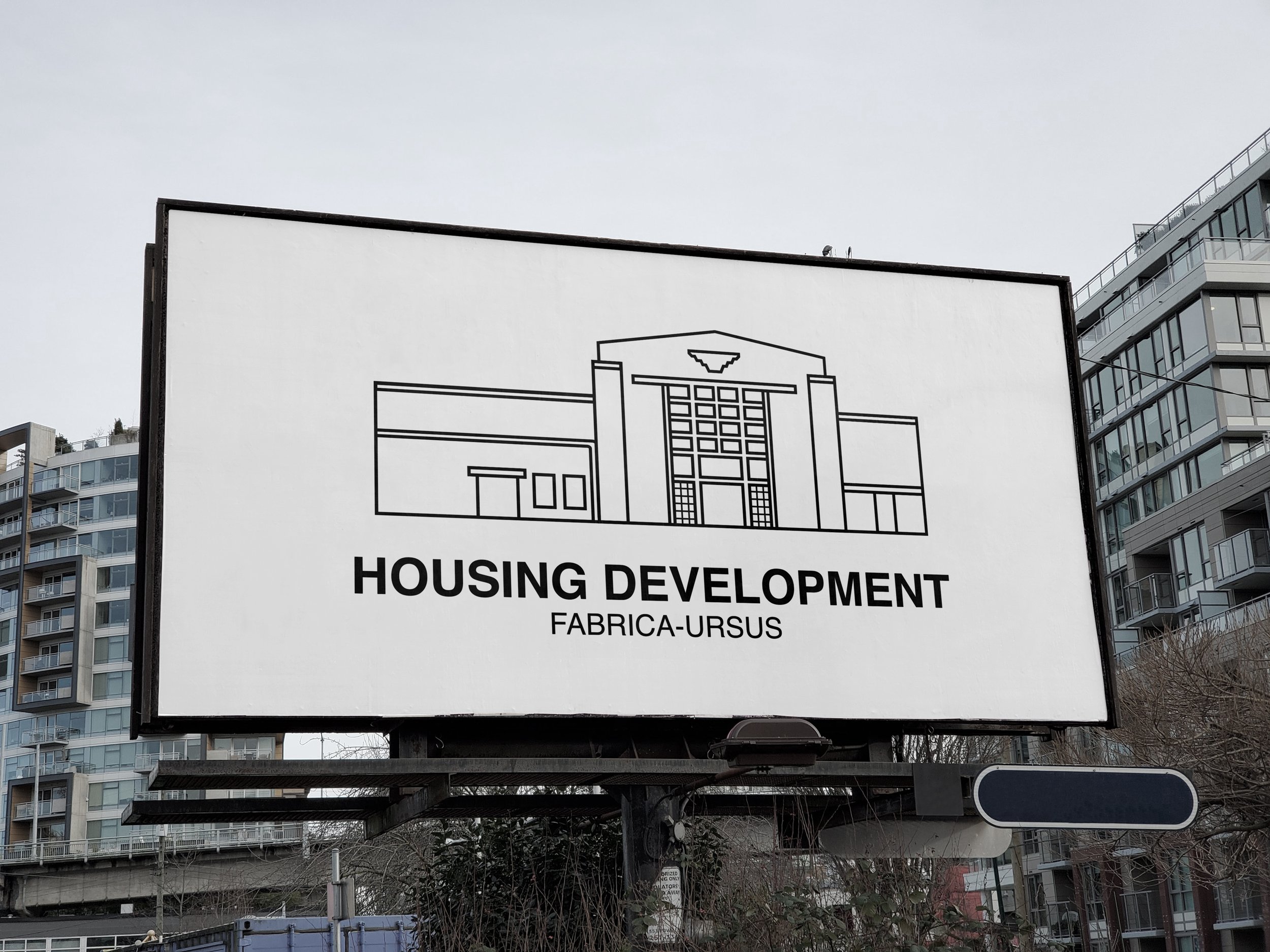
The thought process behind the illustrations focused on embracing the environment, mainly by highlighting the most powerful and distinctive buildings. I was trying to get the sense of connection between the modernist church, shopping center, and more workers-oriented housing development by the same approach of design through similar outlines.
My goal was to achieve cohesive illustrations that took different features and elements and picture them similarly, creating a new quality and connected communication.
During the design process, I put emphasis on highlighting contrast and keeping a consistent vision, merging two font weights and two different architectural styles. Using those tools of contrast by typography and similarity in terms of the design approach, I wanted illustrations to have persuasive power. And be written in the whole context of the social and cultural life of the district's inhabitants.
Firstly, these buildings shape the environment, and secondly, people gather in them, so I wanted to include this sense of communication. It turned out that this is an essential and shared value of the residents of the Ursus district.
d) Icons
In the case of icons, I wanted to continue the direction I chose, which draws from deeply rooted symbols related to the tradition of the district but presents them in a more modern way.
Firstly, I focused on selecting the right signs that reflect the spirit of the district. Secondly, I wanted to maintain consistency and connection between previous design explorations. Therefore, the icon selection and the same outlines are the crucial part.
Context of tradition:
1) “Ursus” is Latin for a bear.
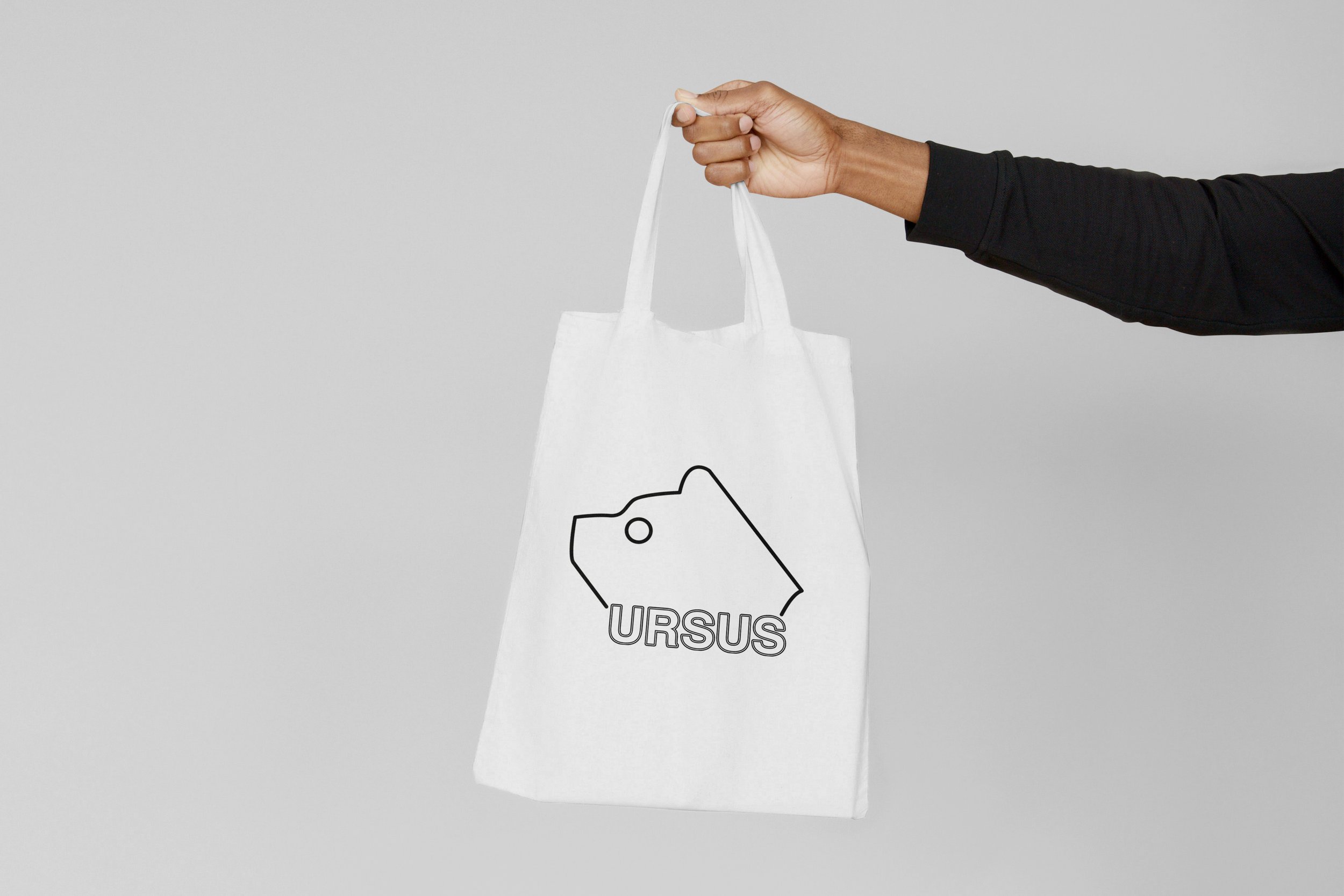
2) Bear is the traditional symbol of the district and this is also the name of the tractor model known for the whole country
3) Ursus was a district deeply rooted in the worker’s class and building infrastructure. Many brick factories were built here.
4) Ursus was also the place where tractors were made and delivered to the whole country
Therefore, the bear and tractors are the most memorable and recognizable Ursus symbols even known for the whole country. Moreover, given the deeply entrenched tradition around the working class, building infrastructure, and factories, it gives the whole context and the bigger picture of the district. So, I decided to maintain those symbols but with modern adjustments.
The legend of the working class, the construction of factories and neighborhoods is also an association of collectivity, community, and mutual aid. These are the values I wanted to provide and put into the bigger context of the district as a safe, open, and helpful place.
One of the symbols is a close reproduction of a tractor model called “Ursus” known for the whole country.
I used the tire as one of the symbols that is associated with the district. However, this design decision is justified and put in a broader context:
Firstly, it reminds me of one of the tractor’s elements.
Secondly, a similar shape was used for the crest of the district and several other uses.
Thirdly, the movement of the tire is related to the sense of change and dynamism. It refers to the current speed of progress in the development of this district.
e) Symbols
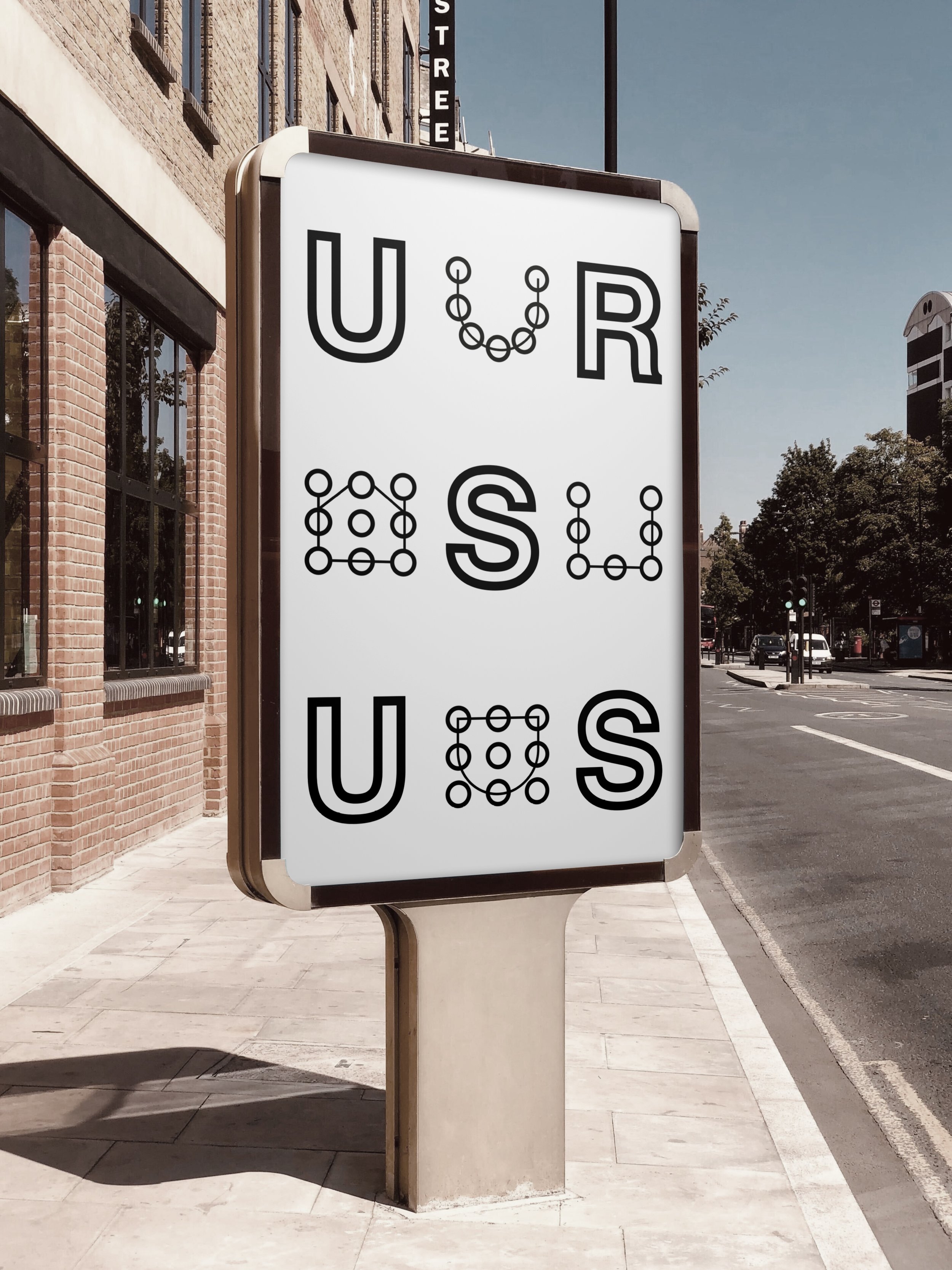
I wanted to divide symbols into two simultaneously working types of design iterations. The first set is four symbols in which I wanted to achieve a sense of connection and security, focused on current residents. The second set is a tribute to the past, though, and often bloody times.
First set:
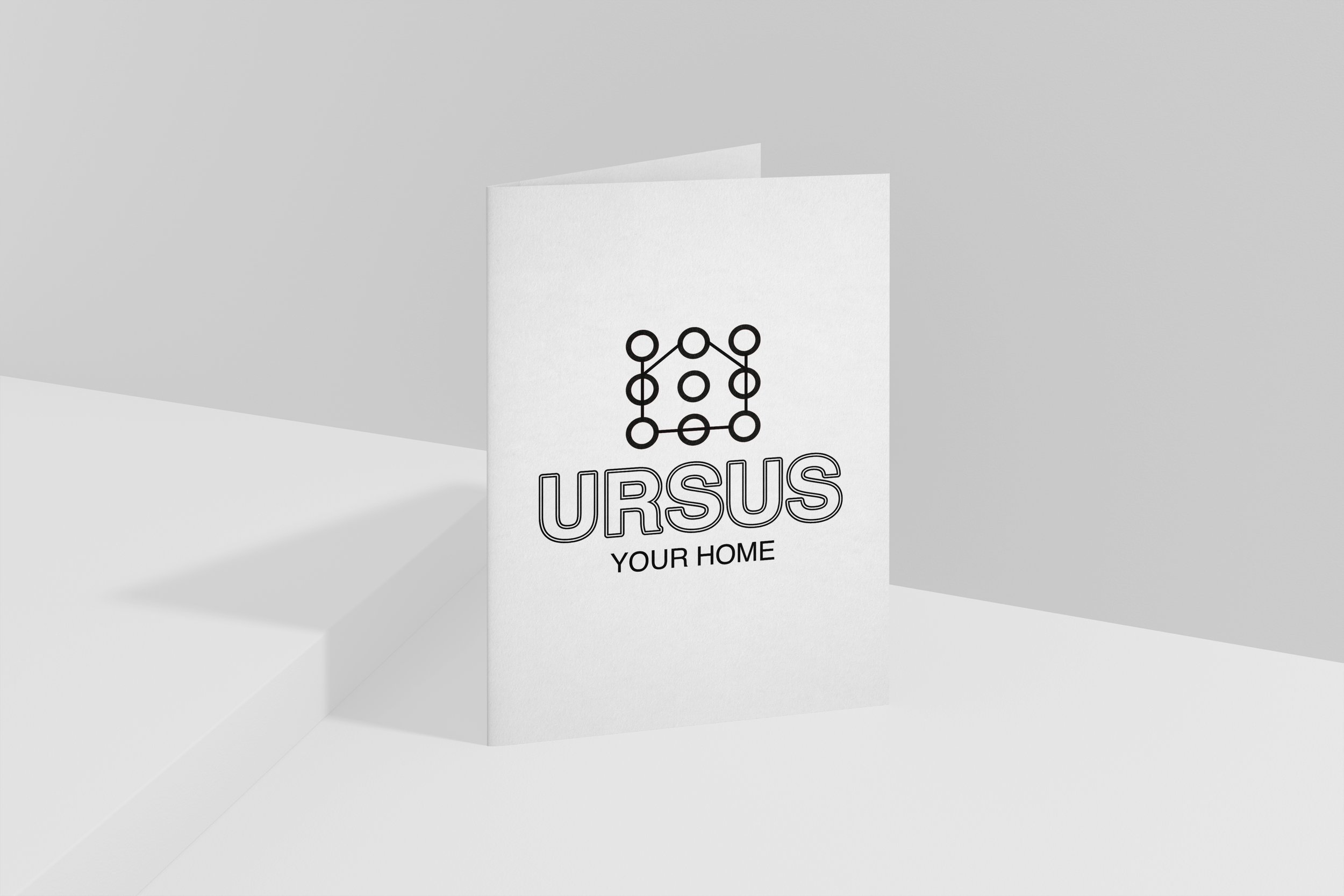
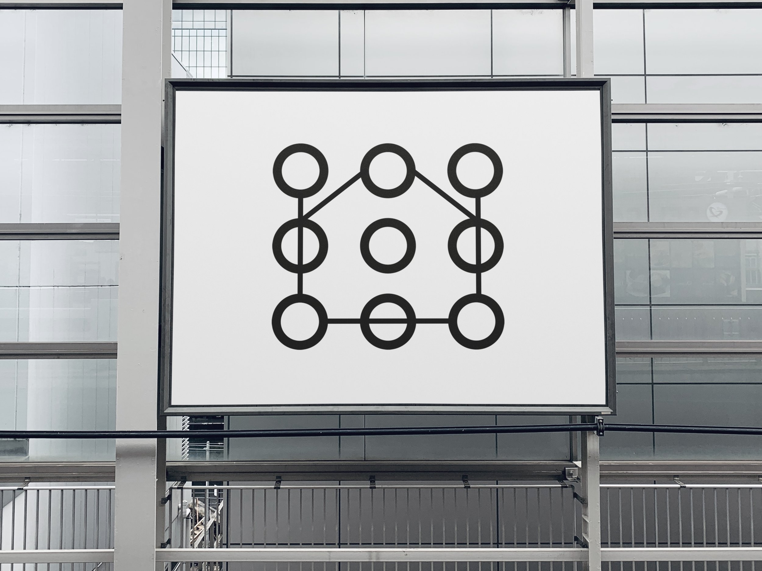
I wanted to achieve an effect that encourages the current people to live in our district. It concentrates on the symbol associated with safety and coziness. Therefore, I decided to use the house symbol and the U-shaped shield, which also refers to the name of the district.
I tried to evoke the feeling of connection and shared future by showing the symbols on the common path connected with the circles.
Second set:
It is associated with important events from the past that shaped and built the present spirit of the district. This is a kind of tribute to the past and the people who built the district.
In the first set, I wanted to give the sense of hope for the shared future and connection by circles on a common path. For the second set, my goal was to evoke similar feelings and refer to a past from which we can learn a lot. Therefore, I decided to use the square, brick-oriented shape.
The brick is associated with a raw material that builds and connects. Directly it’s a tribute to the past when the working class built a lot of brick fabrics, buildings, as well as large communal housing estates. Indirectly it’s about hope for building a better, shared future.
For the description of impactful and historical events, I decided to use typography in the same way as in illustrations to evoke persuasive power and keep the consistency around using Helvetica.
e) Shapes and Patterns
My goal with patterns was to get the more abstract character that opens a place for a broader interpretation and will avoid pigeonholing the district.
I incorporated the previous brand identity elements, such as symbols, logos, and typography into the consistent brand language and the patterns to get the base that allowed me to explore the further design iterations as posters and banners.
I wanted to get the more abstract characters of these patterns and not strictly follow the “simple“ way of icons and symbols. Thanks to the compositions of these patterns, which are not entirely simple. I wanted to give the district a more modernist direction and abstract character.
It gives me room to open the place branding for providing more abstract values, such as love, coziness, and kinship, than just associations with the working-class environment.
f) Brand Language
Brand language is the set of words, phrases, and terms used to describe the purpose and vision behind the brand to build a sense of connection with consumers and users.
As I analyzed and built different types of brands, I found out that the gist is essential when it comes to communicating your message and building a strong and persuasive brand language that people can relate to.
That is why I decided to use universal and uncomplicated phrases that strictly hit the nail on the head. Simple messages, without unnecessary additions, show Ursus as a modern district with a rich history, safe, open, which can be lived by anyone. In short, the essence.
Steve Jobs once said that the most powerful person is the storyteller:
“The storyteller sets the vision, values and agenda of an entire generation that is come“
The essence of showing the district as an inclusive place where everyone can live is to use universal and not complicated words.
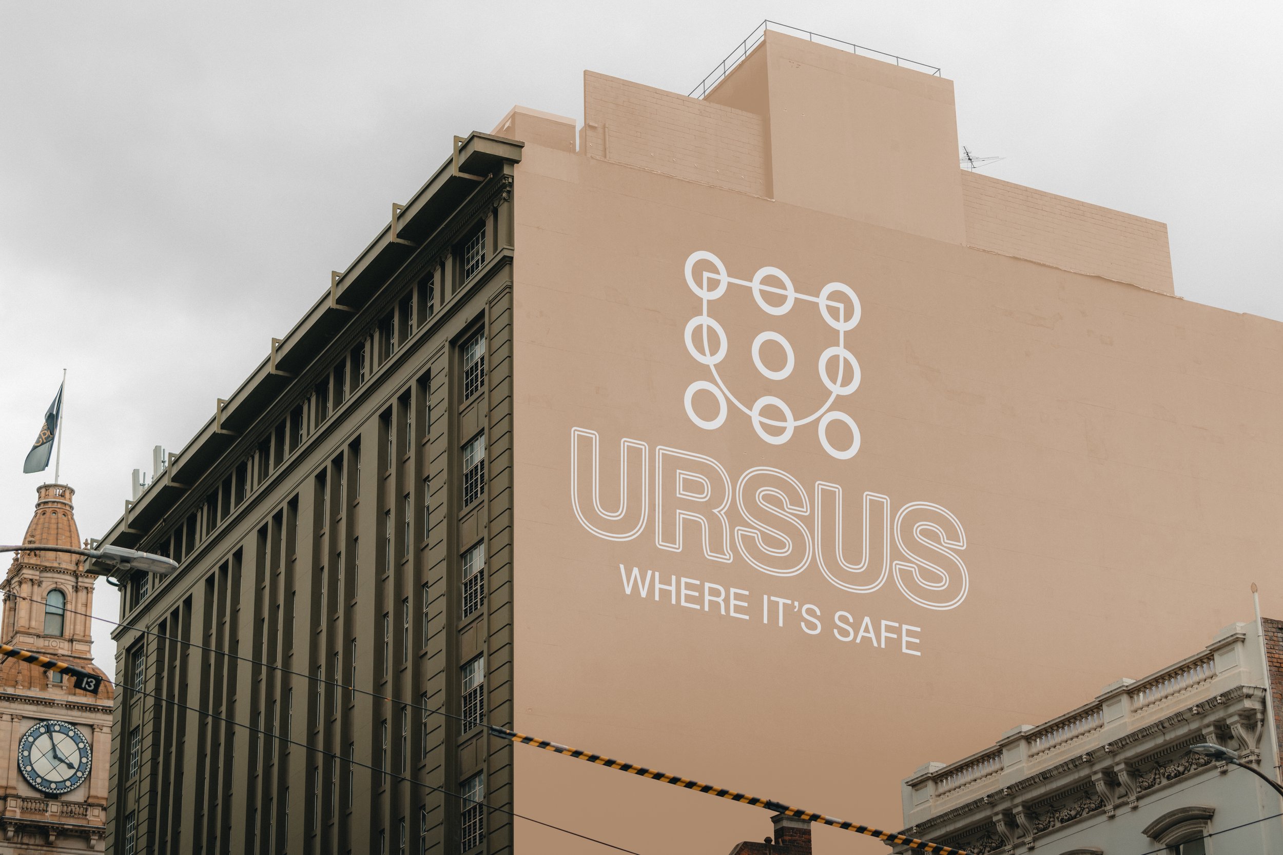
"Your home", "Where it's safe" or "Your place" is a set of expressions that on the one hand can be understood in many ways, but the basis of positive associations is universal for every person because everyone wants to feel at home and live in a safe environment.
“Find your greatness“, “Think different”, and “Meet Me at Starbucks” are the phrases of the most successful ad campaigns.
No fancy phrases, decorative sentences, just straight to the point.
4. Consistent vision - consolidate place branding
Since we have all the elements of place branding, it’s time to implement them in a broader context. It is worth considering what would be the most convincing for the inhabitants in a given context. The question was what elements should be placed in which advertising spaces.
As we previously mentioned I decided to make some logos that can be used interchangeably and for different occasions. That’s why It was easier for me to use different designs. There was more space for flexibility. However, I still want these logos to work together to get the same sense of the same place.
My goal was to unify and expand the whole brand communication that resonates with residents.
I decided to use icons as stickers, patterns for posters, illustrations next to buildings, and logos interchangeably in different places.
5. Final results
Below you can see what the place branding looks like and the visual identification elements that I have managed to create. Hope you learned a lot from this guide. If you have any questions or are interested in cooperation, please contact me by email or Twitter, I'm here to help!
You can also join our “Create & Grow” Community on Discord!

Condensed design explorations in one package:
Thank you for your time!
