Ultimate Guide to Design a Logo From Scratch: How to Make an Outstanding Logo Step-by-Step
People often say that business without logo is like a man without face. I think there may be some truth to it, because logos, like faces, constitute our identity. But creating a logo that will distinguish you or your company is quite a challenge because the process of designing logo must be approached holistically. And It takes a lot of effort to condense all the ideas and features that define us into one sign.
“A logoless company is a faceless man” - David Airey
Many people, even when they are not designers, want to create a logo, but do not know how to go about it. With this guide, I would like to help you design a distinctive logo from scratch. And if you’re already a designer i hope that by this guide you gain a different perspective on the whole process.
Note: As a matter of this guide, I will also design a logo. Each point will be supplemented with a practical application, so on my example, you will see the whole process of designing a modern logo step by step. I will justify each of my choices by referring to the principles of good design and branding practice.
Each chapter consists of theoretical knowledge, so that you can think of creating a logo as a whole that is related to some context, and also "my part", in which, based on photos I will show the practical application and my approach. I think this is an effective way to understand the logo creation process.
1. Start with the basics - research and identifying
Before you move on to the right design part, try to see that the logo that will define the brand exists in a specific context that also includes competition, customers, and values. This step is about setting a direction that allows us to design the logo more easily and accurately.
I recommend beginning with visualizing the values, so grab the pencil and piece of paper and you could start by drawing a mind map. Forget all technology and step away from your computer.
This step is about gathering background information you need to define your brand’s core personality. So you could write down various associations that help you develop a brand vision.
Some questions that might help you:
What values do I want to convey?
What do I want to be associated with?
What’s mine why?
What distinguishes me from the competition?
The process of gathering information and doing research is very important and often overlooked. Remember that this step is crucial because identifying the characteristics of the brand is the foundation on which we will base further design steps and, based on the research we’ve done, we will justify design decisions.
It’s all about creating a coherent vision. And as you know a powerful brand is a brand that has a clear message. You could read about it in my article on the Power of Branding.
My part
My task was to create a logo for a brand that sells home and garden products. The client also wanted the logo to refer directly to the word "haus", which in German simply means home. On top of that, the logo had to match with the advertising campaign. The main theme of the campaign was to show a happy family in the home and garden surroundings with which the company is associated.
The task seemed to be challenging because it is difficult to present something as simple as a house in an original way, bearing in mind that it should form a coherent whole also in the promotional campaign.
Here’s my abbreviated mind map that I’ve created and highlighted the most crucial points.
2. Inspirations
Paula Scher, the legendary graphic designer said that while she’s working with the client, she shows him examples of logos she made and tells him to choose the ones that appeal to him the most. She let them identify with examples to see what form they like.
Even when you’re not a graphic designer, you can use Paula Scher’s principles to create a brilliant logo. I recommend using sites like behance or dribble to review the best works and see what forms and which direction suits you best. On my part, I also recommend the book "Logo Modernism", which is a peculiar collection of well-selected signs. Some people call this book a Bible Of All Logos.
Looking for all sorts of inspiration, even outside the world of design will help you find out which direction you are interested in. It's also worth creating a mood board. Put different logos, colors, and less obvious inspirations next to each other - whatever you can think of. And try to imagine the context in which the logo will function.
Share your inspirations with others, ask them for their opinions. This will allow you to look from a larger perspective and see from the customer's point of view.
My part
Here is a mood board that I’ve created. It seemed to be appealing to the client and it’s turned to be helpful in further steps. I could better understand what my client meant and what he needed. I knew in which direction I had to go, the warmth of family home and the harmony of spirit were the emotions that I wanted to convey through the pictures I selected.
3. Design part - Sketching initial ideas
Now it's time to move closer to the design stage. Do not use a computer yet, try to maintain a more traditional approach, especially at the beginning (your hand, pencil, or pen and piece of paper). Start with very simple and raw sketches, remember that you don’t have to draw great (for example I can’t, I’m poor drawer) Just try to give your sign a certain characteristic look. Check various combinations, placements, cross out, put lines anew. Turn the page upside down, see what the sign looks like now. Cross out the ideas again and start drawing new lines and shapes again. Repeat until you get something you see potential in.
I see that people often don’t fulfill the potential of a given sign, because they start the design process with a computer, which in my opinion is a wrong approach, and especially at the initial stage of designing, we should go back to the roots. This allows you to get to know the sign better and what I like to call “notice the invisible”.
Approach the process of sketching more intellectually than artistically. What I mean by that you should be focused on thinking rather than expressing. Think about proportions, application, arrangement, connections, references, let it be an intellectual struggle. Each element of identity forms part of a larger system, that after applying certain rules, conveys the feelings holistically.
My part
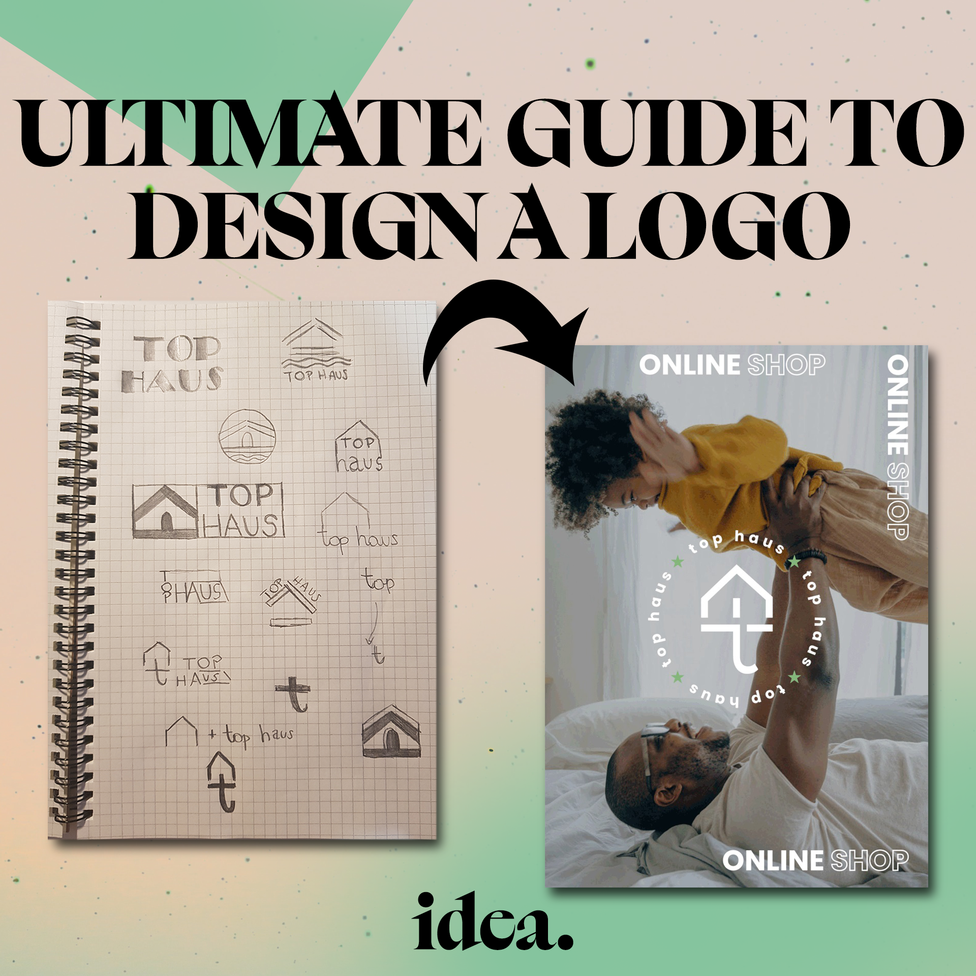
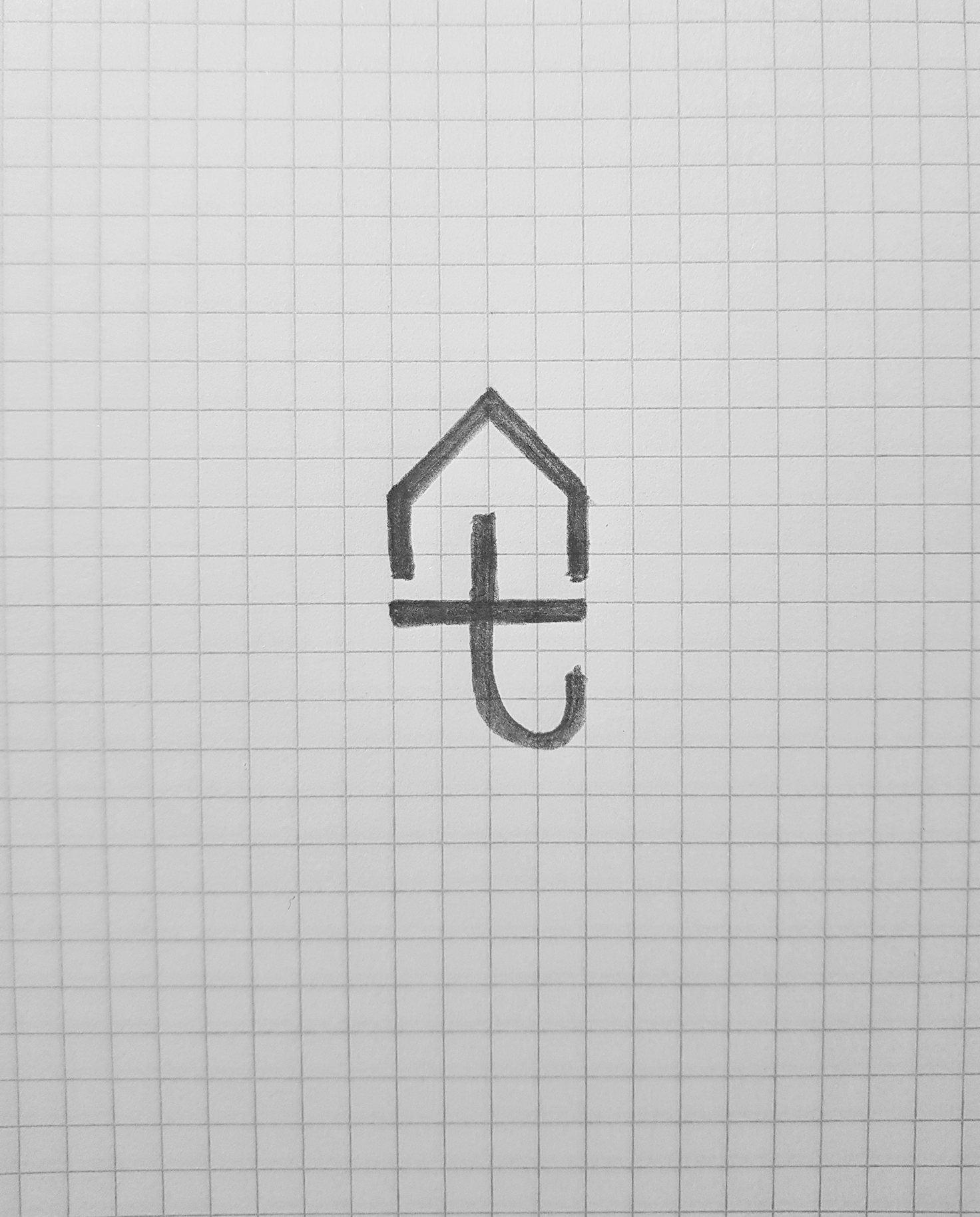
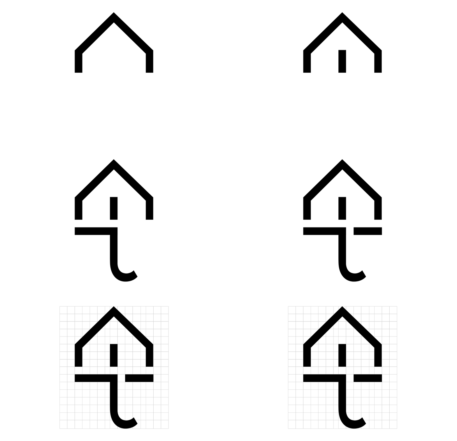
Sketches that I’ve made, as I said I’m not the greatest drawer. But it definitely helped me, and as you can see at the end, the sign begins to crystallize slowly into the logotype that we know from the final and functioning version.
Start adding typeface to the whole logo. Sign the logomark from a different side and see which arrangement of the logomark and logotype fit best.
The combination of logomark and logotype is called a combination mark. A combination mark has a great impact on the customer than the logomark or logotype itself. It helps to enhance the brand vision and tell the brand story more memorably.
Browse the web for different fonts and see which ones you like better. The main division between the fonts that we can distinguish are serif and sans-serif. However, this division is often simplified saying that serif fonts are associated with a more official appearance, which will suit better for state institutions or banks, while sans-serif fonts are associated with a less formal look, making them suitable for modern, minimalistic identifications. Nevertheless, this division is increasingly blurring. And we can see, for example, banks whose logos have a sans-serif font. However, we can say that this division is a kind of starting point, which is worth keeping in mind.
When you find something that causes you some kind of excitement, take a picture of it and transfer it to the computer. Now it's time to choose your tool. The most popular and the most developed tool for creating vector graphics is Adobe Illustrator, however, it is a paid program. If you do not want to spend money, you can use free alternatives such as Inkscape, Gimp, or Vectornator.
My part
This was a sign that appealed to me the most. It’s basically my approach to a logo that should’ve referred to home and the brand name. It is a combination of the letter T (tophaus) and the shape of the house, in a kind of “icon style”, which I eventually slightly modified by removing the element connecting the letter T, which you will see in a later example.
4. The process of application - grid, typeface and colors
The logo doesn't have to tell you directly what the company is doing, but keep in mind the accuracy. Try not to complicate, simplicity mostly determines the power of persuasion and the influence of a logo. It also helps to create a memorable brand mark. Match the font to the symbol. Pay attention to the design elements - proportions, space, contrast. They don't have to be the ideal dimensions, but it is worth sticking to the designated pattern, which of course, can sometimes be broken to a certain degree.
a) Grid
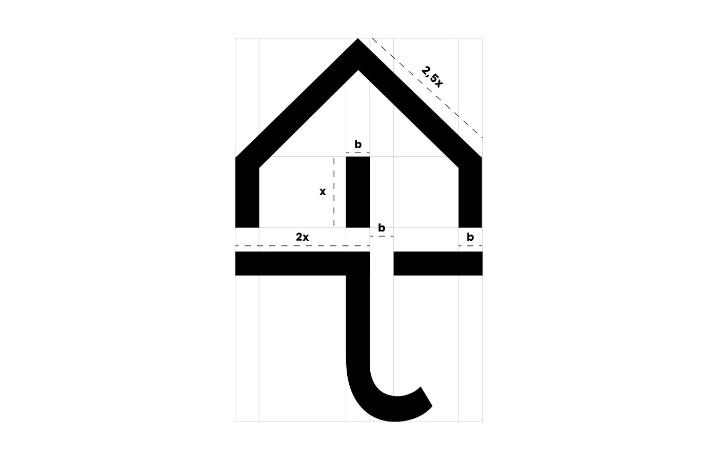
The logo needs to exist in some orderly pattern, best known as a grid. The most famous is the square or circle shape, but basically, a grid is used to organize, align and keep the right proportions. To make everything as pleasant as possible for the human eye, which is sensitive to all kinds of deviations from the "perfect" norm.
Keep in mind that important is maintaining the right proportions not only between the elements, but also the appropriate gaps between them.
The grid is a necessary tool to define certain hierarchies between elements.
Use “invisible tools”, one of the most powerful of these tools is contrast. Properly created contrast within the grid can have a much stronger impact on the recipient. You can create a contrast between the elements themselves in the logomark, between the mark and the font, or between the elements of the combination mark and the space.
My part
I determined the proportions based on the upper element of the letter T, which is a 3x1 rectangle whose side I simply labeled as x and b. As you can see the gaps between shapes are equal to b size. I decided to cut some elements to give the logo dynamism and a sense of movement. In addition, such an approach to design based on breaking patterns, playing with grids and shapes also gives the impression of modernity.
b) Typeface
As before, I wrote about the logo as a certain form of communication between the brand and the customer. Take the same approach to a typeface. Remember that words are the most effective form of communication, they deepen relationships and convey the vision of your brand. They can effectively sell a product or service. That is why it is so important to choose the right typeface that will properly convey the message to the recipients.
What I see from experience is a very common problem of giving the right proportions between the logomark and logotype. A lot of people struggle with this, and it is also my weak point. I find it highly demanding to put lettering that won't "overwhelm" the sign and also not emphasize it too much. It’s difficult to find that “sweet spot” between logomark and logotype. I think that Nike, Adidas, and Chanel did a pretty job.
A good way to make a typeface stand out is to modify the base font, is a good practice to add dynamism or other features that we want to bring out, for example removing a few elements from letters will give the impression of movement.
My part
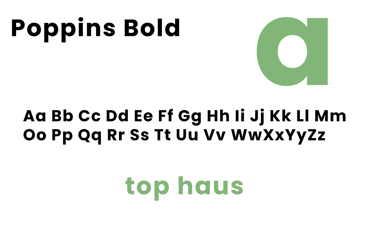
I decided to use the “Poppins” font, it’s free, nowadays often used and what’s important, it matches the brand’s vision. I like that it’s nearly monolinear. It is not a font based on restrictive geometric principles, it is more flexible in its form, so it will work well in creating a vision of a happy home, where relationships are based on emotions and are dynamic.
It will also allow avoiding the vision of another boring home-improvement store. See how beautiful looks the letter "a" enlarged ;)

c) Colors
Colors play a crucial role in perception. It will not be an exaggeration to say that each of the colors is charged with energy, emotions, which affect us in some way. It is no coincidence that the common color in casinos is red, which subconsciously pushes us to take spontaneous, often ill-considered decisions. On the other hand, for example, the color green is associated with grass or leaves, which in a broader sense refers to nature, peace, and harmony. It can have a calming effect on us.
Think about the associations that come to your mind when you think about your brand, what kind of emotions do you want to evoke?
You can list the things you want to associate your brand with and then the colors in which those things occur in nature, which will allow you to identify the right colors and feelings.
My part
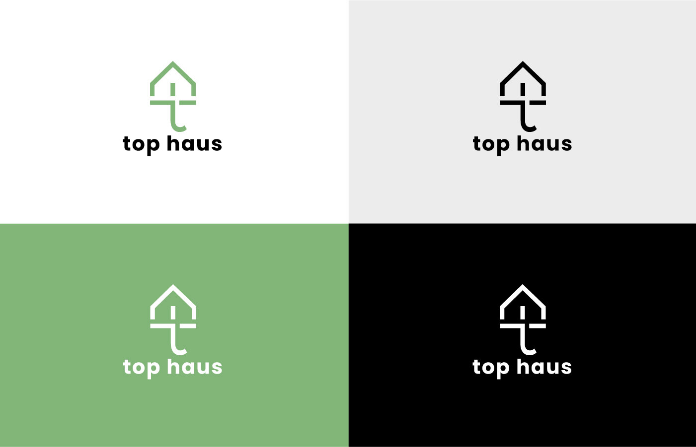
According to the mood board, where there are zen stones and plants, that I connect with harmony, I decided to use green as the main color. This is also justified by the fact that this color is associated with trust, which will make it easier for us to build a bond with customers.
The color green is also found in nature, which may be related to the fact that the company sells products for the garden, and more importantly, indicates the use of natural raw materials.
Other additional colors that complement the brand's vision are white, black, and light gray. I found that these colors go well with green.


5. Consistent vision - consolidate the brand
Our logo is ready, now it's time to implement the logo in a broader context. Before you move on to place the logo on mockups, think about how to efficiently incorporate the symbol into the entire brand communication system.
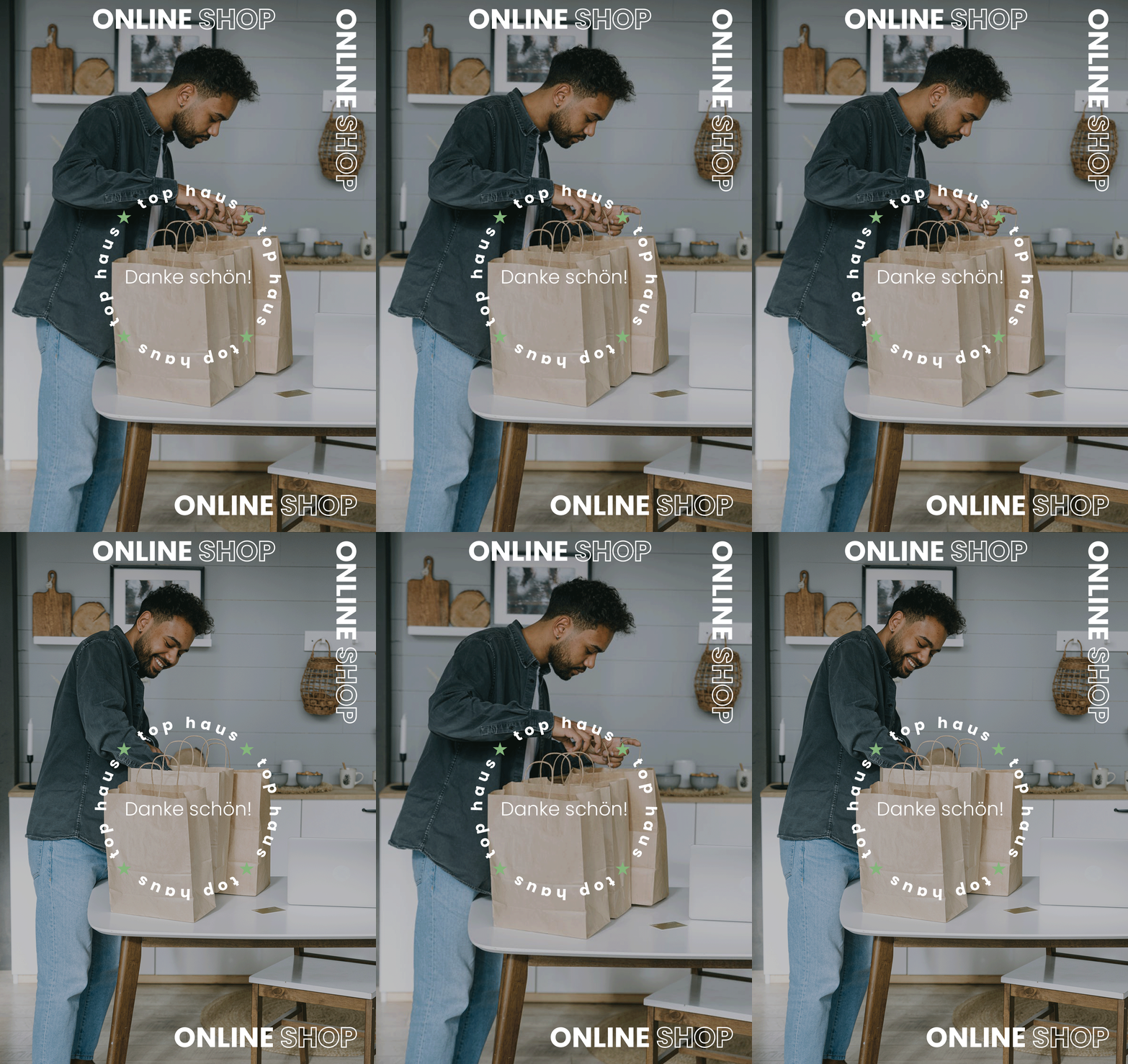
One of the good ways to do this is to extend the functionality of the symbol, e.g. depending on the occasion. When a customer order something from your store, you can change the context of the sign. And on the wrapped gift, use the words "Thank you" instead of the default logotype. Nike uses a similar procedure, and sometimes on their products under the brandmark we do not see the typical lettering "NIKE" and instead "Just do it", which has an even stronger impact on customers because they can better understand the brand vision.
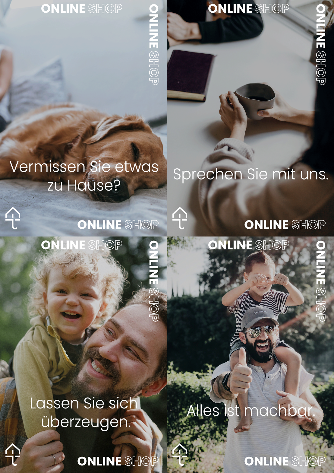
Another great method is to create a series of posters in which you incorporate a symbol, which will increase your brand awareness.
So the main principle that I wanted to convey to you is the wider use of a logo, mark, or typeface, which will certainly unify and expand the whole brand communication, thanks to which customers will be able to identify themselves and feel more connected with the brand.
My part
There is two important design decision that I want to highlight and break down. To consolidate the brand vision and create a bond between customers and the brand, I decided to make an “occasional” type of logo. I expand it in a few ways. The former is more brand-oriented and the latter customer-oriented.
At first, I did not know how to show that the brand also specializes in areas other than the name implies. So I decided that the best way would be to skillfully combine the three areas for which the company wants to be best known: home, garden, floors into one consistent message.
I concluded that the best way would be consistent changes in the logo, which would be integrated so that they would not disturb the order in the customer's perception, but rather interest him and show other areas in which the company specializes.
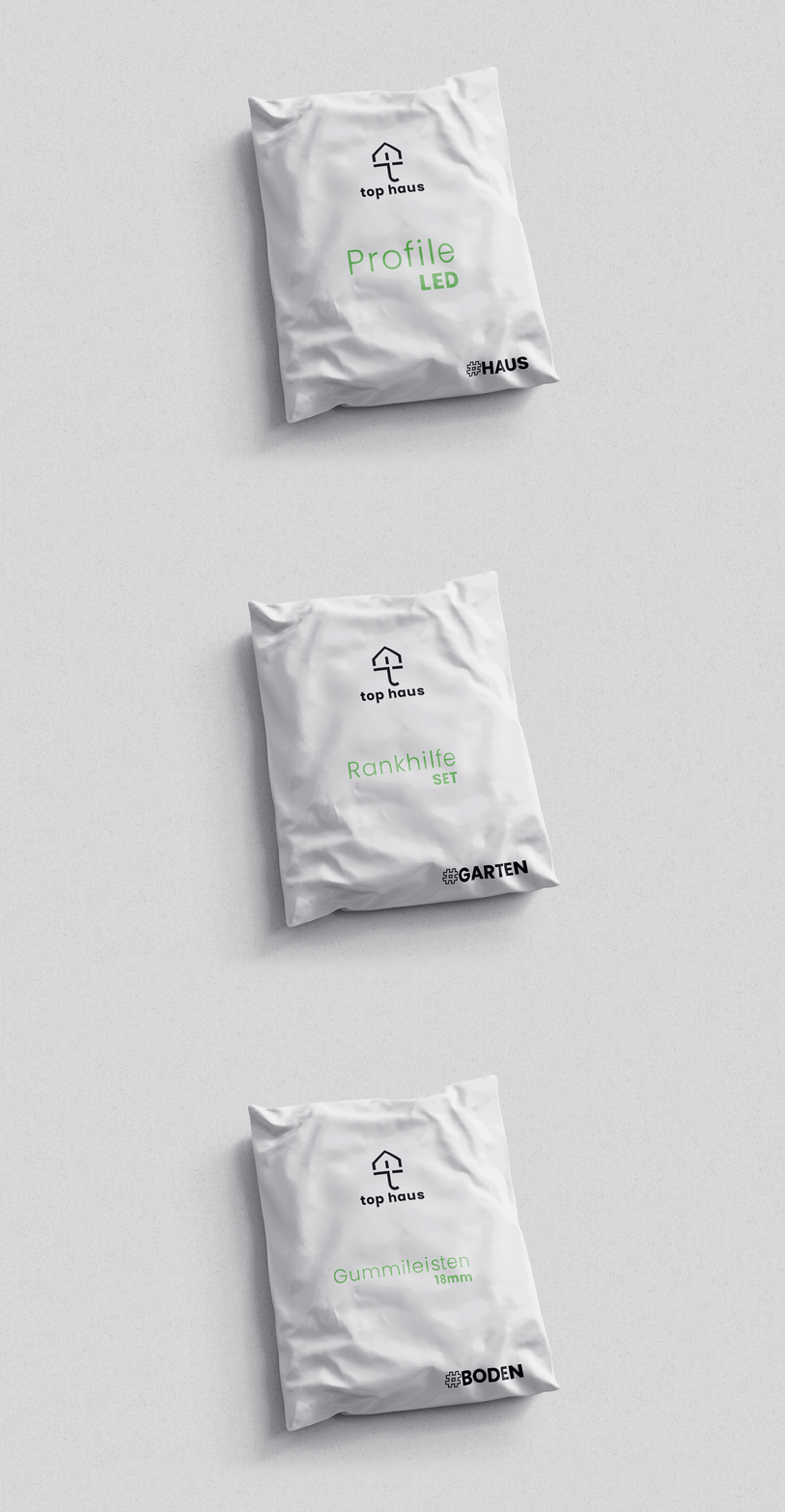
Depending on the field the brand is advertising, I made slightly different types of logos, replacing the word “haus” with “garten” or “boden” (garden and floor in English)
I also noticed the potential in GIFs as a medium for the campaign, which is, firstly, a kind of collage, so you can mix different elements, and secondly, GIFs have a certain consistency, only all the pictures together convey the whole message.
So that’s how I dealt with communication of the extended version of the brand.
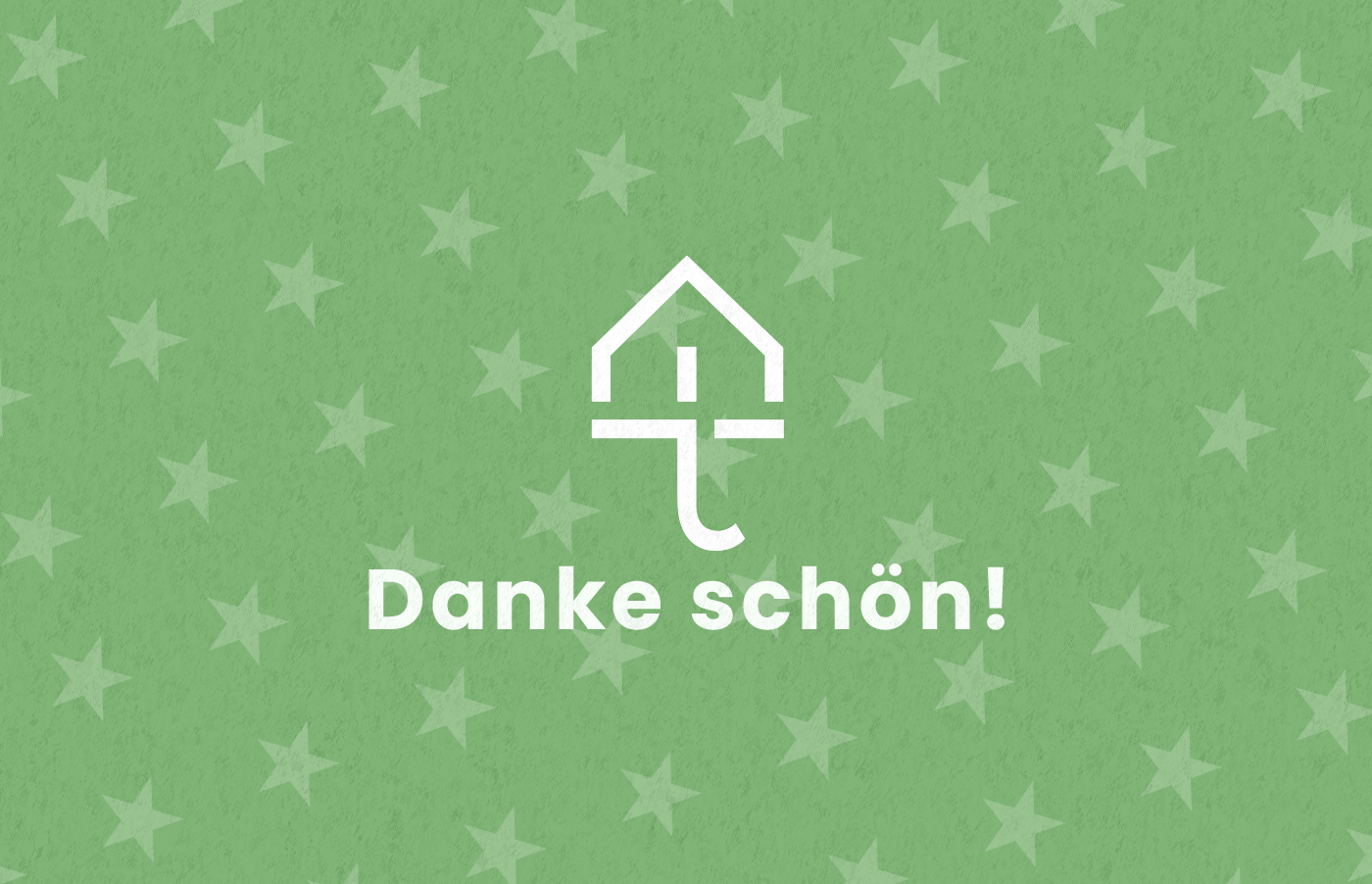
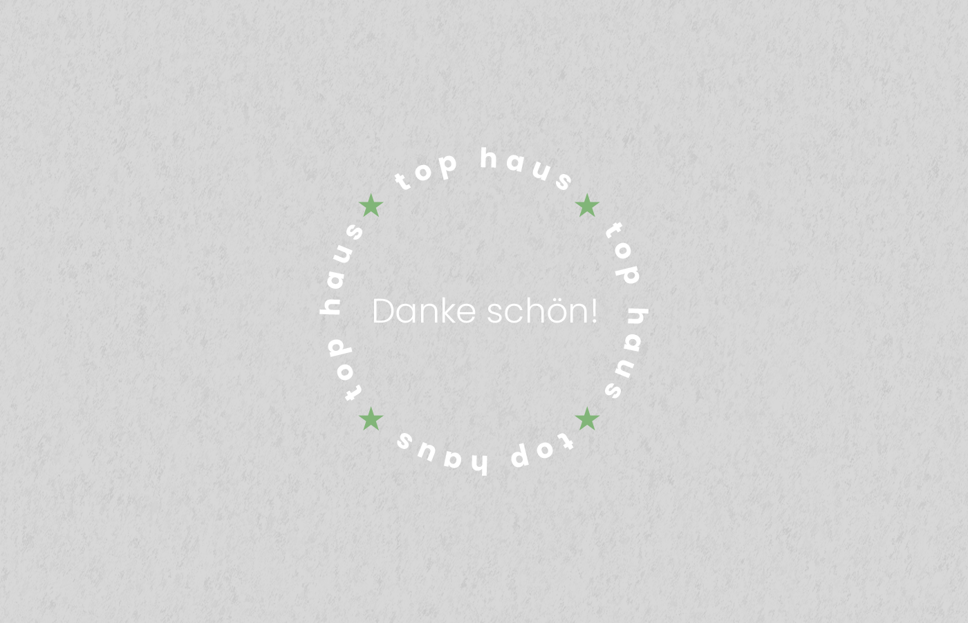
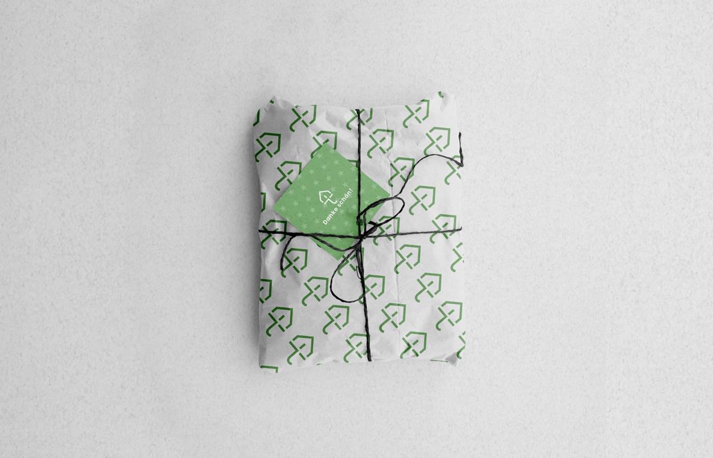
The second decision was to change the brand name to the words of thanks (Danke schön means thank you very much in English). Such activities point how important the customer is for us, and that he is a part of the brand, which means that he also builds and creates it, and as you may know, people love to have an impact on something.
This provided us with a good basis for creating customer-oriented gift packaging.
6. Presentation
Now we move on to the part that many designers consider their favorite, which is putting identification elements on mockups. I always use Photoshop for this stage, but you can also use a free program like Gimp.
Many of us use free mockups, which has its advantages, but the downside of such a solution may be that there will be inconsistency in presenting the brand identity. I recommend websites like MrMockup, which also was used by one of my academic teachers. The use of multiple mockups that come from the same source will allow us to maintain consistency, and the use of free ones will allow us to save a few dollars. This is what we could call a win-win ;)
Mockups that look similar are not enough, you also need to make a few corrections, as well as interventions, such as adding a texture or making colors more coherent and matching, to get the best out of the presentation. Adding texture is a good solution when you want to bring out some brand features, for example adding noise texture is a great solution when your brand looks retro or paper texture when your brand produces homemade items.
My part
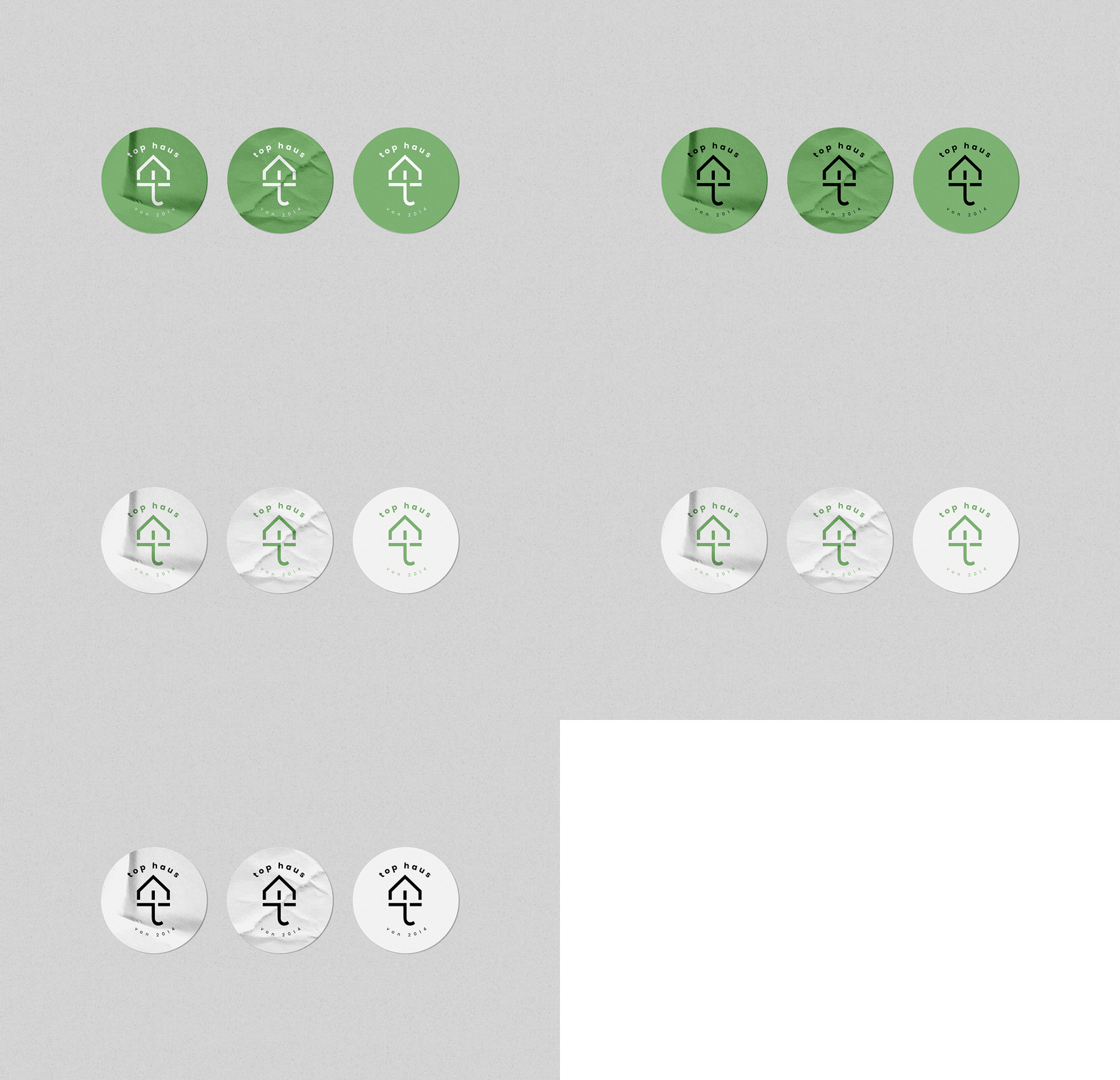
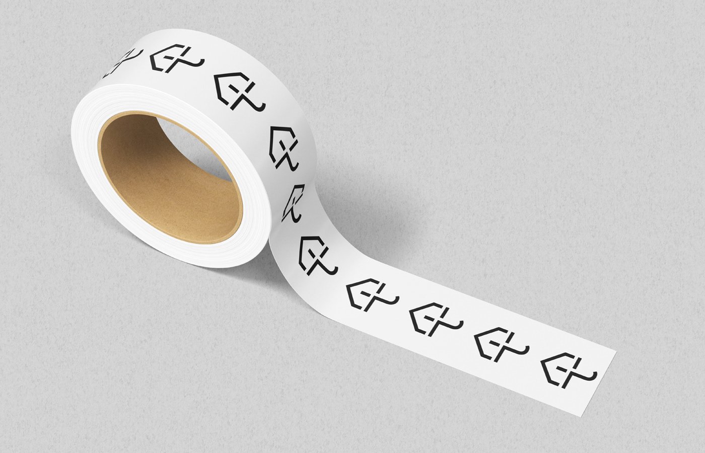
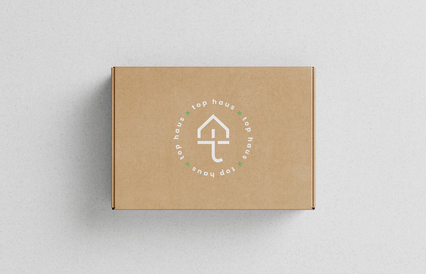
Here are the mockups that I presented. As you can see that I added a noise texture and put the all elements on a grey background that in my opinion goes well with green color as the main motive. By showing these examples, I also wanted to highlight the diversity and expansion of brand awareness.
1) For example, hashtags identify three main brand specializations
2) The stickers contain an additional logo, in which the caption indicates the year of the brand's creation (von 2014 - since 2014)
3) The logo on the last box is in a form reminiscent of the previous logo with the words "Danke Schon" instead of the brandmark.
7. Revision
The work is not finished yet. Get feedback and make adjustments. It is also a time to experiment. Don’t be scared to redefine the concept of the logo (even when it hurts at first).
Firstly, you can make up something even better, although I know, the first thought says otherwise. Secondly, the ability to adapt to changing circumstances generally improves us, because we create and live contextually, which means that we transfer models from one field to another. You will not only be a better designer, but also a student.
8. Final result
This is what the logo looks like and, in part, the elements of visual identification that we have managed to create. Hope you learned a lot from this guide. If you have any questions or you’re interested in cooperation, please contact me via email or Twitter, I offer my help!
If you’re interested in making better decisions, creating better products, and so on, I encourage you to follow me on Twitter - click ;)
Thank you for your time!

