The Best Print Ads: Examples and Lessons From The Golden Age of Advertising
Advertising is a ubiquitous part of our daily lives, constantly vying for our attention through various channels and forms. As we know, advertisements have an extraordinary ability to build a sense of connection and ultimately shape our perception – not only of products but also of the world around us. They mold our understanding of the world and make us want to be part of something extraordinary.
Nowadays, with social media taking over, we are constantly bombarded with lots of low-quality ads, but there was an era where advertisement was a work of art. This era is often called “The Golden Age of Advertising“. It lasted from the mid-1950s to the late 1980s. During that time, advertising was incredibly creative and had a huge cultural impact.
The print ads from “The Golden Age of Advertising“ were well-designed, beautiful in their simplicity, and so powerful that one sentence could change the perception or create a new trend. But nowadays, we don't see ads as art anymore. The word "advertising" has become boring and turned into bland "marketing."
Legendary designer Tobias Van Schneider referred to today’s ads as overlooked at best and annoying at worst:
“Several decades later, the art of advertising is dead. What was once a full-page print ad is now a website banner. What was once a smart headline is now a tired pun. What was once nuanced is now on the nose. What was once focused on the consumer’s interests now leans on the product’s features. What was once simple is now overworked.“
In an era where instant gratification and “good enough” prevail, it's worth delving into the timeless examples and principles of The Golden Age of Advertising. Perhaps these times will resurface, and you want to create something that stands the test of time.
Many timeless print ads from the Golden Age of Advertising are still breathtaking because the essence of their power lies in the original ideas, clever twists, punchlines, and sometimes heroic narrative. They paid attention to layout and conceptual brilliance that gave people magic “aha“moments.
What was simple and well-designed now is chaotic. But there are still companies that can come up with remarkable ads. I think the art of advertising is worth studying, and there’s no better way than looking at the greatest print ads from the era of “The Golden Age of Advertising“. And hopefully, my selection of advertisements from that era will inspire you to create something outstanding.
1) Porsche, 1983
During the "Golden Age of Advertising," Porsche stood out from its competitors with its unique approach. Porsche not only created numerous iconic print ads but also established its recognizable style characterized by white backgrounds, clear car photos, bold statements, and thought-provoking slogans presented in simple yet powerful typography.
Among Porsche's vintage ads, one that stands out is the 1983 ad titled "Nobody's Perfect." This advertisement deviated from the traditional approach of promoting flawlessness. Instead, it embraced imperfection by emphasizing the tagline "Nobody's Perfect." This cleverly positioned Porsche as the ultimate choice, setting itself apart from other brands.
The ad challenged the conventional belief that advertising should only highlight perfect products, pushing the boundaries and resonating with consumers on a deeper, more human level by acknowledging imperfection, which we all share.
What makes this ad fascinating is how it taps into the broader trend of the Golden Age of Advertising, where brands began incorporating storytelling and emotional appeal into their campaigns. Rather than merely showcasing product features, advertisers recognized the importance of building a connection with the audience through relatable narratives.
Lesson: If you’re going to humble brag, use humor. People who admit flaws are more relatable. The same applies to companies. They use emotional appeal to connect with consumers on a more human level.
2) Apple, 1984
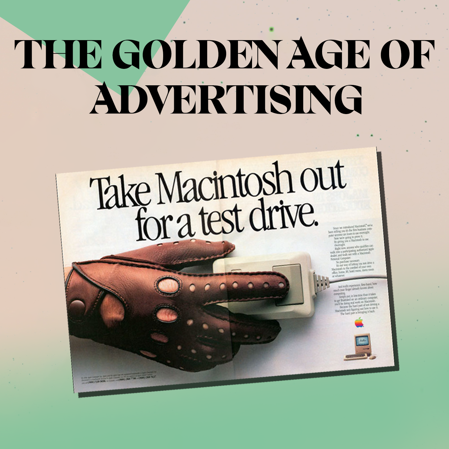
In 1984, Apple launched the legendary Macintosh computer, accompanied by a groundbreaking commercial titled "1984." This commercial debuted during the Super Bowl and depicted a dystopian society under the control of oppressive figures reminiscent of Big Brother. It positioned the Macintosh as a symbol of liberation. This emphasis on evoking emotions and moving beyond traditional product-focused advertising is also evident in one of history's most popular print ads, "Test drive a Macintosh."
The print ad effectively captured the revolutionary nature of the Macintosh, not only through bold messaging but also with its cinematic-like quality. The placement of a hand on the computer mouse evoked the motion of a driver, pushing the boundaries and establishing an emotional connection with the audience through the power of analogy and contrast. While computers are perceived as static tools, this ad suggested that using a Macintosh would make the user feel like a driver, compared to a thrilling, dynamic experience that taps into our desires.
What's common in Porsche and Apple advertisements is that they frequently aim to differentiate themselves from their competitors by presenting a unique proposition. The Porsche ad "Nobody's Perfect" acknowledged imperfections while emphasizing superiority and distinctiveness. Similarly, the Apple ad positioned the Macintosh as a revolutionary and transformative product that would revolutionize the world of technology.
Lesson: Move beyond traditional advertising. Engage customers and convey the value, using empowerment and novelty with intrigue. “Test drive a Macintosh“ is a perfect example of an ad that generates curiosity and intrigue by inviting people to experience something new and revolutionary.
3) Volkswagen, 1966
The 1966 Volkswagen Beetle ad featuring Wit Chamberlain is a brilliant example of minimalist advertising that effectively highlights the car's abilities through clever and humorous descriptions.
The power of this ad undoubtedly lies in its well-crafted copywriting.
"They said it couldn't be done. It couldn't"
This phrase cleverly plays with words to emphasize the skepticism surrounding Volkswagen's capacity to produce a compact, affordable, and reliable car. However, it implies that the skeptics were proven wrong. Volkswagen defied doubts by successfully creating an exceptional vehicle that surpassed expectations.
“Actually, there’s only one part of a VW that you can’t put much into. The gas tank. But you can get about 29 miles per gallon out of it“
This line is my favorite part. It emphasizes the efficiency of Volkswagen cars and suggests that while the gas tank may not hold much fuel, the vehicle can go a long distance on a small amount of fuel due to its fuel efficiency.
It’s worth saying that during the Golden Age of Advertising, there was a shift towards innovating and daring messaging that went beyond traditional product promotion, which we noticed in previous print ads.
Similarly, to Apple, the bold message in the Volkswagen ad lies in its defiance of conventional expectations and challenging the status quo. The thought-provoking copywriting, particularly the confident and attention-grabbing phrase "They said it couldn't be done. It couldn't" generates intrigue and captivates the audience.
Lesson: Prove them wrong. This ad implies that while others doubted the capabilities of Volkswagen cars, they succeeded in proving them wrong and surpassed doubters' expectations.
4) Omega Speedmaster, 1976
The 1976 Omega Speedmaster ad, renowned for its memorable line, "How can a man in a $27,000 suit settle for a $235 watch?", effectively communicates a powerful message of status and sophistication. This ad, similar to many from the Golden Age of Advertising, uses a clever tagline, conveying the bold message that disrupts the status quo of equating high price with quality.
Omega skillfully highlights its product through the art of storytelling, employing close-up imagery and impactful analogies. This powerful approach allows the audience to experience the product from a fresh perspective, making it all the more remarkable. A similar tactic was used in the previously described Apple ad, "Test drive a Macintosh."
Omega places a strong emphasis on showcasing their watches not only as timekeeping devices but also as equipment used in NASA flights. The ad specifically references the Apollo-Soyuz mission, which marked the first crewed international space mission conducted jointly by the United States and the Soviet Union in July 1975. By juxtaposing the exorbitant price of an expensive spacesuit with the seemingly more modest price of the Omega Speedmaster watch, the ad implies that even extraordinary individuals recognize the superior value and quality embodied by the Omega watches.
In the context of the Golden Age of Advertising, this ad represents a departure from the conventional approach of equating high price with quality. It introduces an element of surprise and intrigue by questioning the choice of an expensive suit paired with a relatively affordable watch. This approach reflects the era's emphasis on creativity, innovation, and pushing boundaries in advertising.
Lesson: Master the art of storytelling. Omega Speedmaster print ad demonstrates how crafting a compelling narrative can elevate an advertisement’s impact. By juxtaposing men in an expensive spacesuit with a seemingly incongruous choice of a $235 watch, the ad invites the audience to perceive the Omega watches as a symbol of pride.
5) BMW, 1965
BMW's iconic print advertisement captures the essence of the brand's promise: an unparalleled riding experience coupled with a profound sense of fulfillment. In the Golden Age of Advertising, brands often used storytelling or catchy phrases to gradually evoke emotion. In this case, BMW uses a gradation of happiness to convey its message.
This ad reflects the trend of lifestyle advertising during that era, where brands aimed to associate their products with desirable experiences and aspirations. Golden Age posters typically featured a simple layout with a clean background, bold typography, close-up images, and thought-provoking statements or slogans.
In this BMW ad, they use an easily readable, clean sans-serif font and close-up images of their vehicles to deliver a powerful statement. The ad's vertical layout emphasizes the importance of each element, and the concise message of happiness leaves a lasting impression on viewers. Furthermore, the design elements in this ad are reminiscent of Porsche's ads from the Golden Age of Advertising.
Lesson: The gradual progression of emotions in the ad, culminating in a clear punchline, helps create a deeper connection with consumers.
6) Apple, 1986
Apple has released numerous iconic ads over the years, but this 1986 print ad introducing the Apple IIgs stands out as a prime example of the company's mastery in leveraging associations and comparisons, a trademark approach closely associated with its co-founder, Steve Jobs. By skillfully employing vivid comparisons, this print ad effectively showcases the extraordinary capabilities and versatile applications of the Apple IIgs computer across multiple domains.
“It can sing like Caruso, talk like Barrymore and calculate like Einstein. It can paint like Kandinsky, play like Paderewski, and teach you who both of them are“
This ad aims to position the Apple IIgs as a powerful and versatile computer that transcends conventional expectations. By drawing comparisons to iconic figures, the ad implies that the IIgs empower users to achieve greatness and explore their passions with the help of advanced technology.
Additionally, this ad invites us to reflect on the transformative power of Apple technology. It suggests that the Apple IIgs is not merely a machine, but a conduit for human expression, unlocking hidden talents, expanding intellectual horizons, and connecting users to the profound achievements of past visionaries.
Apple's print ad encourages us to view their technology not merely as a tool but as a catalyst for personal growth and creative exploration. This is why people find it easier to connect with Apple ads, as their computers are perceived not as soulless devices but as gateways that unlock the boundless potential and possibilities within us. In short, the copy of this print ad reduces the gap between machine and human creativity.
Lesson: Evoke imagination and aspiration. By using vivid comparisons to iconic figures in arts, sciences, and culture, the ad sparks curiosity and invites the audience to envision the limitless possibilities offered by the Apple IIgs. Show people how to unlock their full potential. As Steve Jobs said in the iconic Think Different commercial:
“The people who are crazy enough to think they can change the world are the ones who do.”
7) KitKat, 1960s
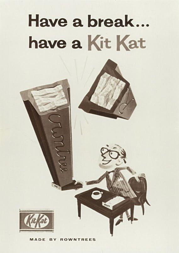
KitKat’s iconic campaign, “Have a Break, Have a Kit Kat“ embodies the brand's message of taking a moment of respite and enjoyment with their chocolate wafer bars. The slogan itself plays a crucial role. Its universal message can be applied in every area of our lives, providing a refreshing pause from the bustle of the daily hustle.
The key point why the Kit Kat print ad is so powerful is that it effectively communicates the convenience and versatility of the product in various situations. In short, the flexibility of the phrase “have a break“ became the key to its longevity.
The ad features a clean vertical layout with well-organized whitespace, allowing viewers to absorb the message. It suggests that activities like a bus ride, reading a newspaper, or participating in a school play rehearsal can be enhanced with the enjoyment of a Kit Kat.
The well-written copy with a playful serif font, similar to Cooper, concludes with a call to action that urges the audience to "Get some [Kit Kat] today". It encourages consumers to take a pause and enjoy the product, appealing to the era's emphasis on connecting with the audience's desires and providing moments of indulgence and pleasure.
Lesson: The power of this ad lies in its ability to tap into the daily routines and experiences of the target audience. Create an association between the product and daily activities by making up memorable catchphrase that resonates with consumers.
7) Nike, 1989
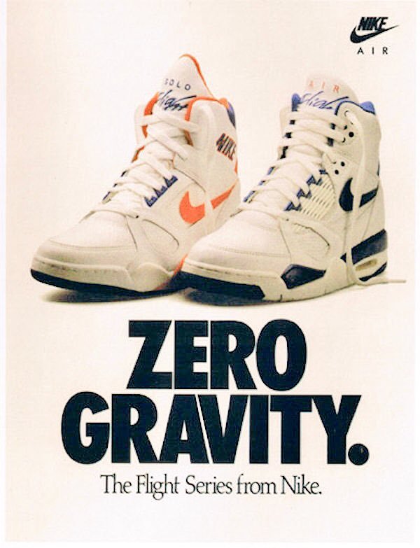
Nike's advertising during the Golden Age of Advertising, especially in the 1980s, brought about a paradigm shift in the industry with its influential and inspiring campaigns. This particular print ad exemplifies a visually captivating composition. Its minimalist yet effective layout showcases the product prominently. Nike uses bold typography and incorporates the statement "Zero Gravity" to accentuate the advanced technology and innovation of Nike's Flight Shoes series. More importantly, it captures the essence of exceptional performance.
The Nike print ad titled "Zero Gravity" from the Flight Series effectively communicates the concept of lightweight and high-performance footwear. With a visually captivating composition, this ad follows in the footsteps of Nike's iconic campaign, "Just Do It" by successfully capturing the essence of Nike's spirit and enduring as a symbol of the brand's identity and achievements.
Lesson: Emphasize performance. By capturing the concept of innovation, this print ad sparks curiosity, inspiration, and a desire to transcend limits.
8) Lego, 1981
The famous LEGO poster ad from 1981 with the phrase "What it is is beautiful" captures the essence of LEGO's timeless appeal and creative possibilities. The ad showcases a colorful and imaginative LEGO creation, highlighting the beauty that can be achieved through the versatility and unlimited potential of LEGO bricks.
The phrase "What it is is beautiful" encapsulates the idea that LEGO allows individuals to bring their ideas and imagination to life, creating something unique and visually appealing. It celebrates the beauty of self-expression and creativity.
“Have you ever seen anything like it? Not just what she’s made, but how proud it’s made her. It’s a look you’ll see whenever children build something all by themselves. No matter what they’ve created.“
This print ad communicates that LEGO is not just a toy but a tool for artistic expression and innovation. It encourages individuals to embrace their creativity, showcasing LEGO as a medium that enables people to build beautiful creations that they can be proud of. Additionally, this writing leaves room for freedom of creation. They didn’t label the piece this girl made, which also connects emotionally with the audience because people don’t like to be judged but love vulnerability.
LEGO print ad “What it is is beautiful“ from 1981 inspires individuals to embrace their imagination and showcases LEGO as a tool for creating beautiful and captivating designs, aligning with the spirit of self-expression and joyous play that defined the Golden Age of Advertising.
Lesson: Capture genuine emotions. LEGO print ad from 1981 highlights the emotional impact of the product. It reinforces the idea that LEGO helps foster creativity, independence, and a sense of accomplishment.
Joyful self-expression and the spirit of play can also extend the creative possibilities of Lego.
For example, adding finishing touches to the assembled Lego and adding artistic and interesting Custom Sticker can make the finished product look brand new. This not only cultivates children's independent hands-on ability but also allows children to use their unlimited imagination to create a brand new and beautiful work based on the original one.
Therefore, the significance of Lego advertising is far more than this.
9) Coca-Cola, 1970s
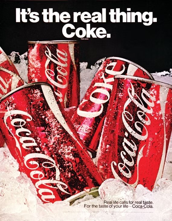
Throughout its history, Coca-Cola has launched numerous iconic campaigns. One of these notable campaigns was the 'It's the Real Thing', which symbolized the brand's commitment to authenticity and its desire to be recognized as the original cola, in contrast to Pepsi.
The poster prominently showcases a glass filled with the iconic beverage, placing a strong emphasis on the product itself. Its purpose is to evoke a refreshing taste and accentuate the beverage's iconic status. Vibrant colors, notably the brand's signature red, are used to create a visually striking impact. The advertisements from the 'It's the Real Thing' series feature bold and dynamic typography, effectively presenting slogans.
Coca-Cola's slogan, "It's the Real Thing," emphasized the authentic choice for a refreshing drink, positioning Coca-Cola as a timeless and trustworthy option. The clean and well-organized layout of the poster, with its central focus on the Coca-Cola glass, vibrant colors, and confident typography, conveyed a message of dependability and satisfaction. It also aligned with the era's emphasis on iconic messaging.
Lesson: The power of authenticity. In a world full of countless options and imitations, consumers value companies that demonstrate their uniqueness by being genuine, staying true to their brand values, and conveying a sense of authenticity.
As a globally renowned brand, Coca-Cola is known for its classic red logo and curvilinear bottle image. It is not only a beverage brand, it also interacts with consumers by creating a unique brand experience. Custom metal signs can play an important role in the brand experience.
For example, in theme restaurants, memorials, or brand experience stores, these signs can be used as part of the decoration and information display to help create an immersive brand atmosphere, allowing consumers to feel the unique charm of the brand more deeply and deepen the brand impression.
Custom metal signs are not only part of the brand identity, but also a symbol of brand culture and values, which can help brands stand out in the fierce market competition.
10) Citroën, 1980s
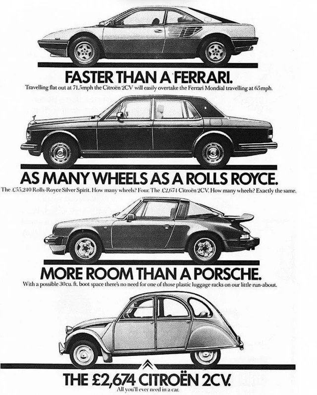
Many car companies’ print ads from The Golden Age of Advertising showcase the advantages of their product comparatively. This Citroën 2CV poster presents a clever and attention-grabbing comparison to highlight the unique qualities of the Citroën 2CV.
"Faster than Ferrari. As many wheels as Rolls-Royce. More room than a Porsche. The £2,674 Citroën 2CV"
The ad's power lies in capturing attention through bold comparisons and challenging traditional perceptions and expectations. By highlighting the standout features of the 2CV and its accessible price point of £2,674, the ad creates a compelling value proposition for potential buyers.
Furthermore, the ad appeals to a broader audience by showcasing that the 2CV offers desirable qualities typically associated with luxury cars at a fraction of their cost. It taps into the aspirational desire for performance, stability, and spaciousness while presenting an affordable option that aligns with the practical needs of everyday consumers.
What’s remarkable about this poster ad is that Citroën 2CV has all the qualities typically associated with luxury car brands. The vertical layout with bold typography works well together to position the Citroën 2CV as a remarkable and versatile car, challenging the preconceived notions about performance and luxury associated with other brands.
Lesson: Challenge preconceived notions and disrupt established narratives by boldly comparing the 2CV to luxury car brands like Ferrari, Rolls-Royce, and Porsche. This ad breaks conventional expectations and sparks intrigue.
11) Pan American Airlines, 1956
The 1956 Pan American Airlines print ad, featuring a mother and child on a plane with the copy "Europe is only a dream away - when Uncle Sam's your Skipper," effectively conveys the notion that Pan American Airlines, as a trusted American airline, can transform the dream of traveling to Europe into a reality.
This vintage advertisement stands out as the oldest on my list, but I found its insightful copy worth mentioning because it easily evokes emotions, sparks curiosity, and positions Pan American Airlines as the conduit for fulfilling people's dreams.
The first part of the copy suggests that the dream of visiting Europe becomes attainable. And the inclusion of the phrase “when Uncle Sam’s your Skipper“ implies that Pan American Airlines is a carrier, reinforcing a sense of trust and safety. Additionally, the photo of the family members' peaceful sleep emphasizes this sense of reliability.
This ad from the beginning of the Golden Age of Advertising skilfully taps into viewers' aspirations, promoting the airline's accessibility, reliability, and trustworthiness as key factors in transforming the dream of traveling to Europe into a tangible experience.
Lesson: Master the power of imagination to transform aspirational dreams into tangible realities for customers.
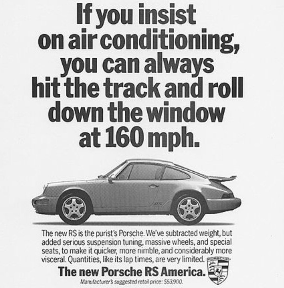
12) Porsche, 1967
The most popular Porsche poster print ads were known for a simple layout, minimalistic design, and bold typography that convey attention-grabbing messages. In this case, this poster uses provocative language and a daring approach to emphasize the immediate impact, appeal, and desirability of owning and driving a Porsche car.
The design of this print ad aims to capture the essence of luxury and sophistication associated with the Porsche brand. It utilizes high-quality photography and minimalist aesthetics to create an alluring visual appeal. Additionally, the typography is clean and bold sans-serif font conveying a sense of modernity and confidence but also seems timeless. This Porsche print ad embodies the Golden Age of Advertising’s trend of bold and daring messaging that aimed to engage the audience and create a memorable impression.
Lesson: From this Porsche ad, we can learn that the combination of humor and cleverness to convey the statement make it easier to tap into desires and aspirations. It resonates with people on an emotional level because of the human need for validation and admiration.
If you found this article intriguing or are interested in collaborating, feel free to connect with me on Twitter or visit my personal website.
Here’s also the gallery of different posters you may find interesting and inspiring.
